Etsy A/B Tests Smaller & Shorter Product Titles
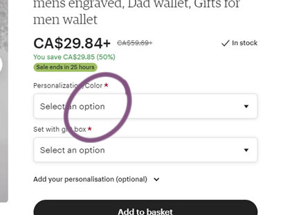
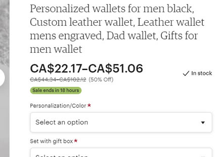
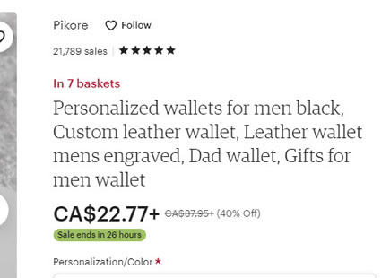
Etsy just ran a simple little experiment that changed their product titles into smaller and truncated ones. The outcome looks like it has been rejected so something didn't work out here. The experiment is also somewhat confounded (size, truncation and raised primary call to action) so it's hard to know which of the three changes had an effect - if any. Nevertheless, this just might be a feint signal of evidence in here in favor of larger, longer and more descriptive product titles as in the control.
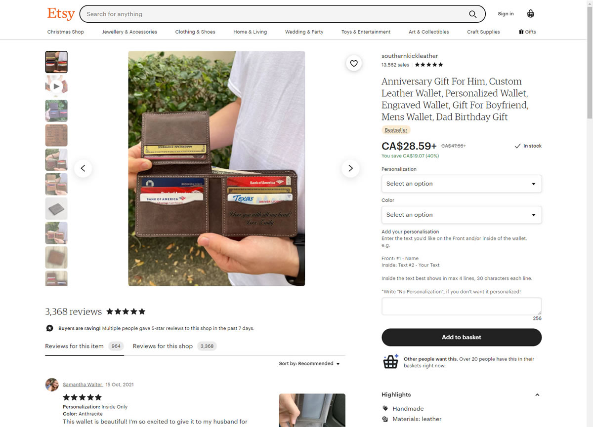
B - Oct 26, 2021 Screenshot
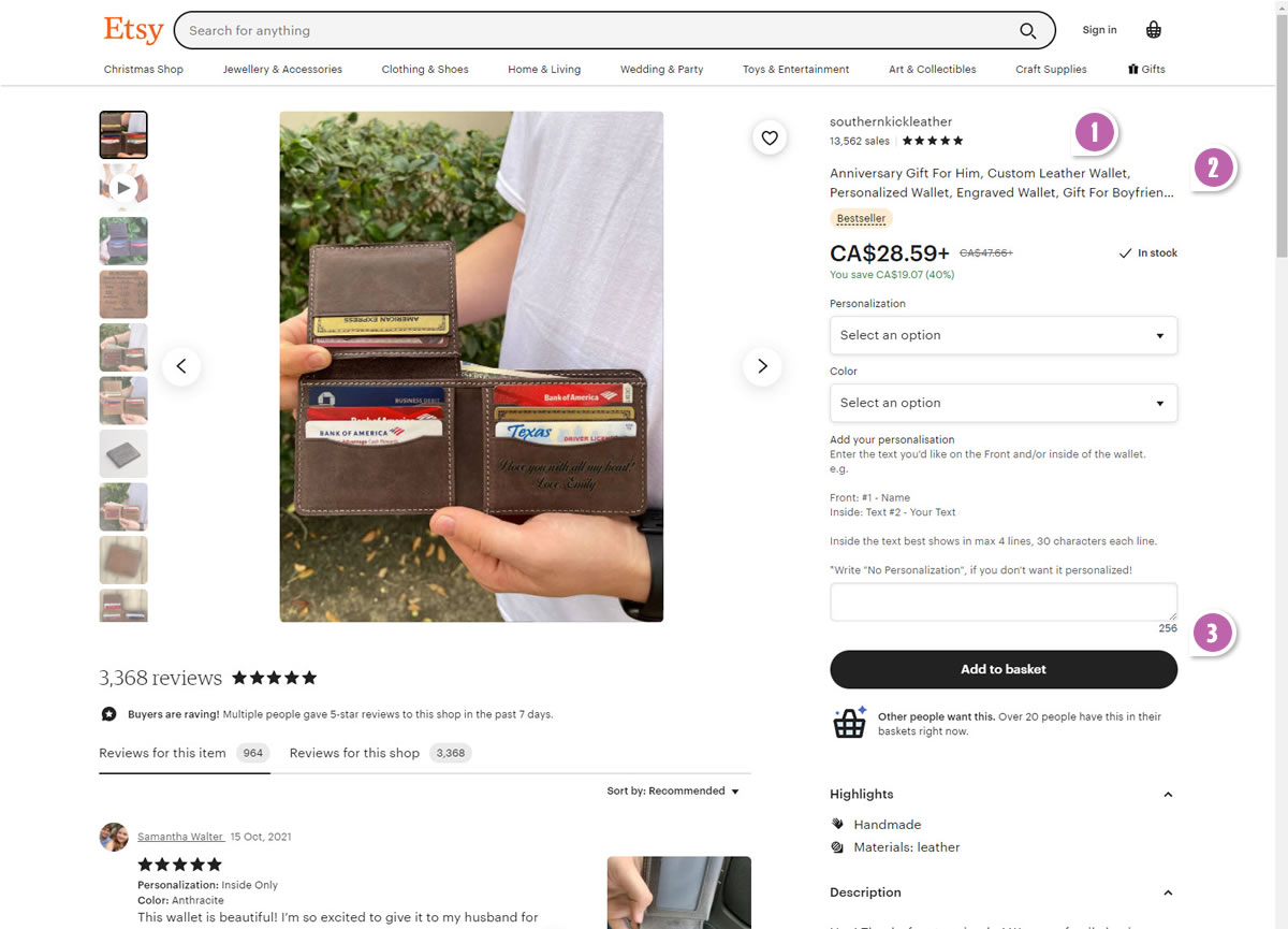
Highlighted UI Changes From This Leak
-
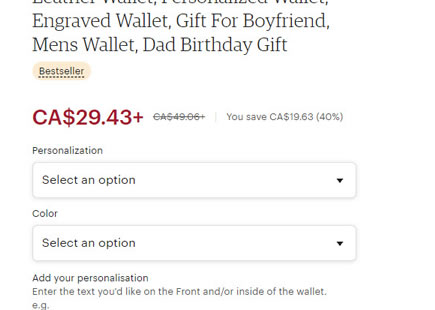
Smaller Product Titles
Here we can clearly see that first change in the variation with the font size of the product titles being decreased. Could this change carried a negative impact? Perhaps.
-
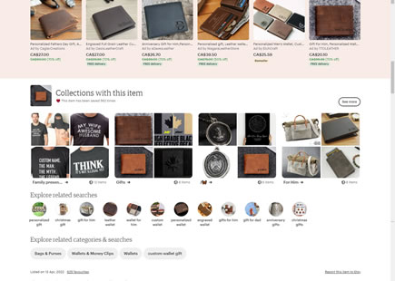
Shortened Product Titles
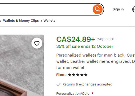
On top of the font size change, the length of the product titles was also truncated as some descriptive copy have been cut off and replaced with cotinuation marks (...). By relating this change to our Long Titles pattern, we could make a bet that this might have carried some negative effect.
0.5 Repeatability has been assigned to Pattern #43: Long Titles as evidence that it's getting better
Repeatability is a net count of evidence for or against a pattern. It’s how we can predict which patterns are better than others. :)
-
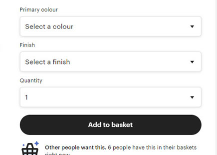
Higher Call To Action
Finally, as a compounded result of all these changes above, we noticed that the primary add-to-cart button also shifted higher. Given that calls to action above the fold are usually a good thing, we could infer that this might have been a subtle positive. But since the positition change was so subtle and the button was already quite visible in the first place, I'd say that this was negligble.
This is very similar to Pattern #49: Above The Fold Call To Action
Comments