Etsy A/B Tests A Winning Shipping Timeline
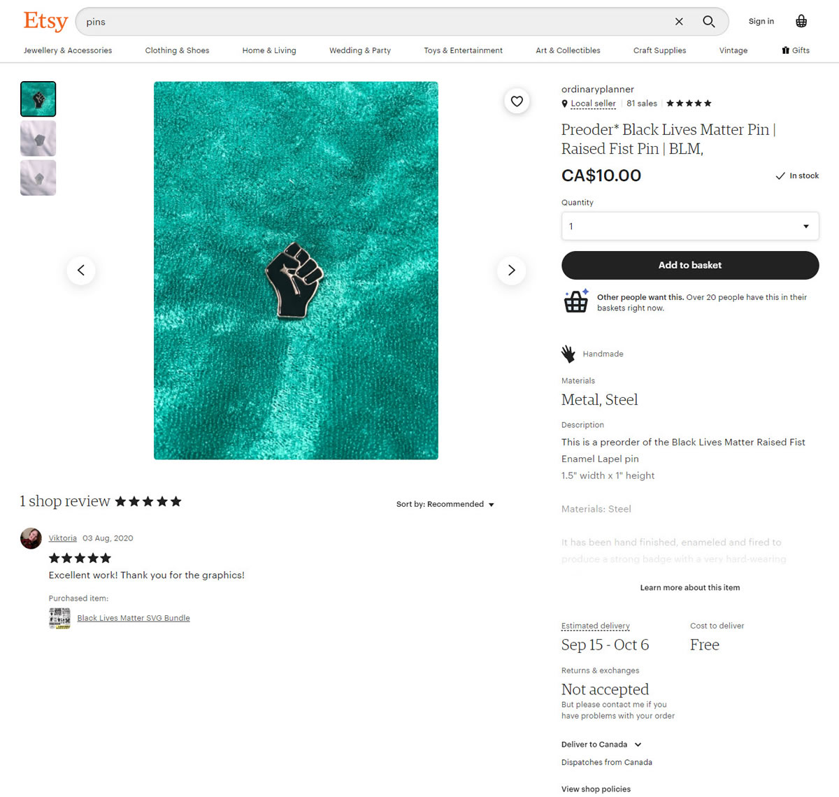
Etsy ran an interesting experiment on their product pages by trying to clarify the shipping process. In this a/b test we can see that the control version displayed a simple delivery range with text. Whereas the variation displayed a linear shipping timeline with 3 steps - possibly creating a stronger sense of urgency. Checking up on this a few months later, we detected that the variation was implemented.
A
-
Sep 10, 2020 Screenshot
IMPLEMENTED
Confirmed
Nov 24, 2020
B - Sep 10, 2020 Screenshot
B - Sep 10, 2020 Screenshot
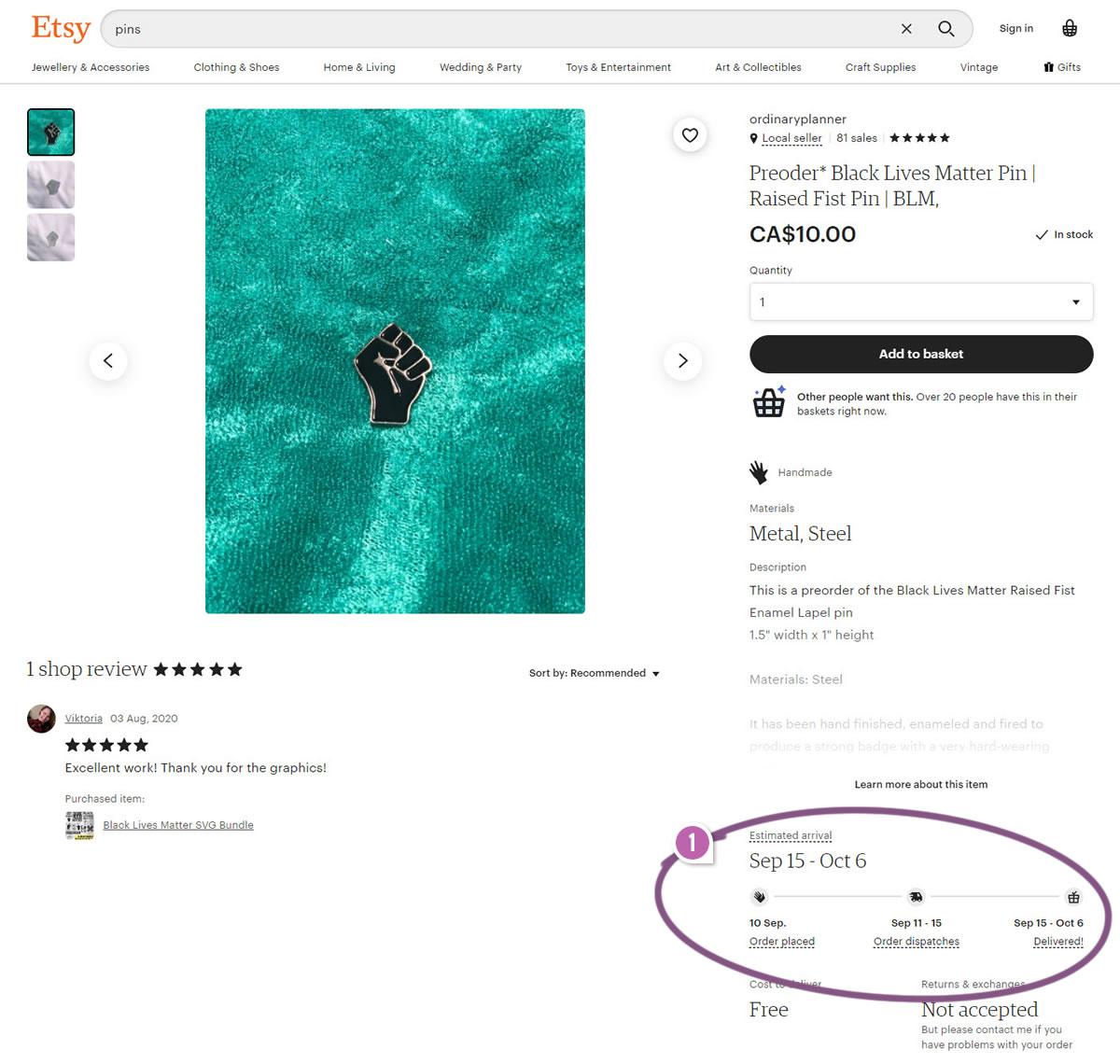
Highlighted UI Changes From This Leak
-
Detailed Shipping Timeline
Here we can see the 3 stepped shipping timeline. The first step shows today's date and implies that everything else that follows is conditional on ordering today - creating a possible urgency. The remaining steps communicate when the order dispatches and when it is delivered using approximate ranges.


Comments
Atanas Zaprianov 4 years ago ↑1↓1
This could also create a feeling of control/certainty in the buyer. They now know the range.
In the same time, this also creates great expectations management. They hope for the best case but are not "angry" that it came later than expected as long as it is in the range.
Reply