Booking.com A/B Tested And Exposed Incremental UI Controls
I especially like this particular leak because there is a slight possibility I might have actually inspired Booking to a/b test it - how cool is that? In late November of 2018 I shared some search concepts, one of which suggested incremental UI controls for Booking's guest selector. More interestingly, this concept was also predicted by the heavily positive exposed menu options pattern (backed by numerous experiments with a high degree of repeatability). Fast track to January and I was able to detected a very similar idea being actively a/b tested on the Booking homepage - hmm, interesting. :)
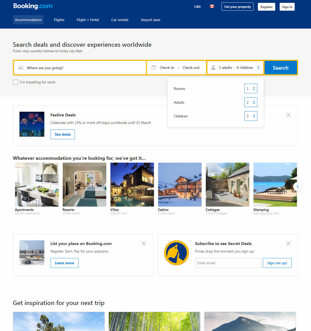
B - Jan 2, 2019 Screenshot
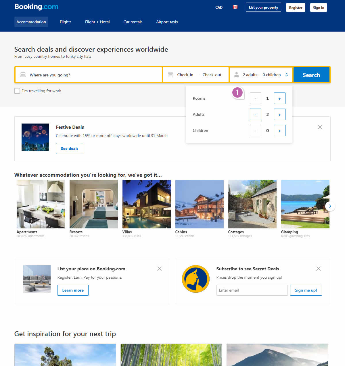
Highlighted UI Changes From This Leak
-
Exposed Menu Options
From the above screenshots taken on the same day, it's pretty clear that the guest selector has been experimented with. The control (A) version had a pulldown menu inside a pulldown menu. As users first expanded the guest selector, clicking on the guest numbers would then also launch a second pulldown menu. The variant (uhm similar to our search concept from 2 months earlier) removed one layer of this UI compexity by exposing two "+" and "-" controls beside each guest type (adults, children) and room count.
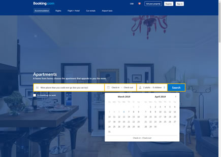
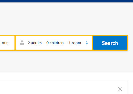
Then when we checked for traces of this experiment in early March, it became clear that Booking decided on and implemented version B (as predicted by this evidence-based pattern).
Glad it worked out for their team and that we were able to learn a little something from their wonderful a/b test.
Thanks Booking! :)
0.5 Repeatability has been assigned to Pattern #14: Exposed Menu Options as evidence that it's getting better
Repeatability is a net count of evidence for or against a pattern. It’s how we can predict which patterns are better than others. :)








Comments
Mario Lurig 6 years ago ↑1↓1
Sure, I can see why that won, but that's only because I can SEE. I think this UI choice goes too heavily toward sighted visitors and makes it much harder for those using a screen reader, something I doubt they split tested for.
Reply