Booking Sticks To A Traditional Breadcrumb After Rejecting A Multi-Dimensional One
Booking ran a sitewide experiment where they tested two types of breadcrumb navigation. The contending variation showed a breadcrumb with two dimensions: displaying the geographical hierarchy of how deep someone is within the site (as expected), and also displaying a menu (on-click) with a secondary dimension of stay types for each level. It might have seemed like a nice idea but it didn't cut it. As the a/b test completed, the idea was rejected in favor of the old-school breadcrumb approach. Nice try booking. :)
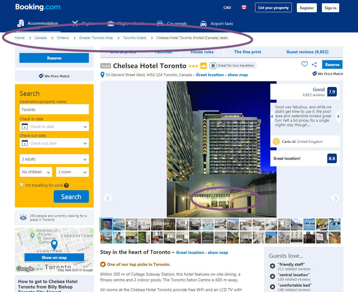
B - Aug 27, 2019 Screenshot
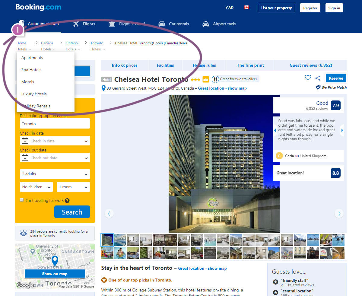
Highlighted UI Changes From This Leak
-
Two Dimensional Breadcrumb Navigation
In the control version, we see a traditional breadcrumb which simply shows the depth of hierarchy (geography) along with where a user is in. The breadcrumb also allows moving backwards to any of the previous levels by clicking on the links (Home, Canada, Ontario, Toronto, etc.) Classic stuff.
The B variation also had this functionality, but additionally, it displayed a secondary category (stay types) for each geographic level, turning this into a two-dimensional breadcrumb.
Why might have the B version failed? There might be numerous reasons and I'll try to list them out here.
For one, perhaps the B breadcrumb added way too much cognitive complexity by displaying numerous "Hotels" links everywhere. If users started searching by their preferred geographical context, the added stay types might have added confusion. While clicking on any "Hotels" link, users are forced to make a double choice (geography + stay type) with a single click.
Secondarily, this approach also diluted the greater clarity of the traditional breadcrumb that answers "where a user is currently in".
Finally, perhaps because the conventional breadcrumb is so widely used across so many other sites, users might have been expecting the simpler approach.
Of course, let's keep in mind that trying to dissect and explain experiments post-hoc should be considered more hypothetical than definitive. It's easy to point fingers. Seriously, hats off to Booking for trying something more riskier for us to learn from. :)
Want Fewer Failing A/B Tests?
We're tracking the effects of similar a/b tests as patterns to understand which ones work and which ones don't. All experiments results are available to members that want to speed up their experimentation potential.







Comments
Rick Deeks 5 years ago ↑0↓0
Is this breadcrumbs primary purpose for user navigation? or SEO?
Reply