Booking A/B Tested 3 Search Bars Challenging The Fewer Form Fields Pattern
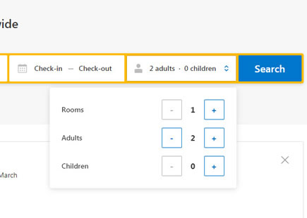
I've been watching this Booking experiment closely ever since sharing a very similar concept some months ago. Their homepage was openly challenged with the UI hypothesis of exposing a "room quantity" field right in the search bar (instead of hiding it in a pulldown). Their team took the initiative to run this as a test. Based on the observed outcome and roll out decision it turns out that the UI concept was better than their control (A). What was a little off however was the actual cumulative prediction (a slight -0.75 mentioned in the concept) based on two conflicting patterns: Exposed Options (for) and Fewer Form Field (against).
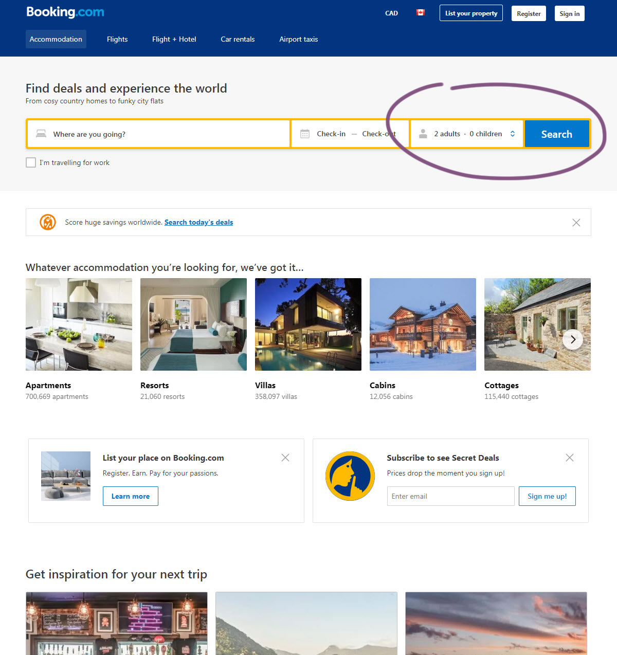
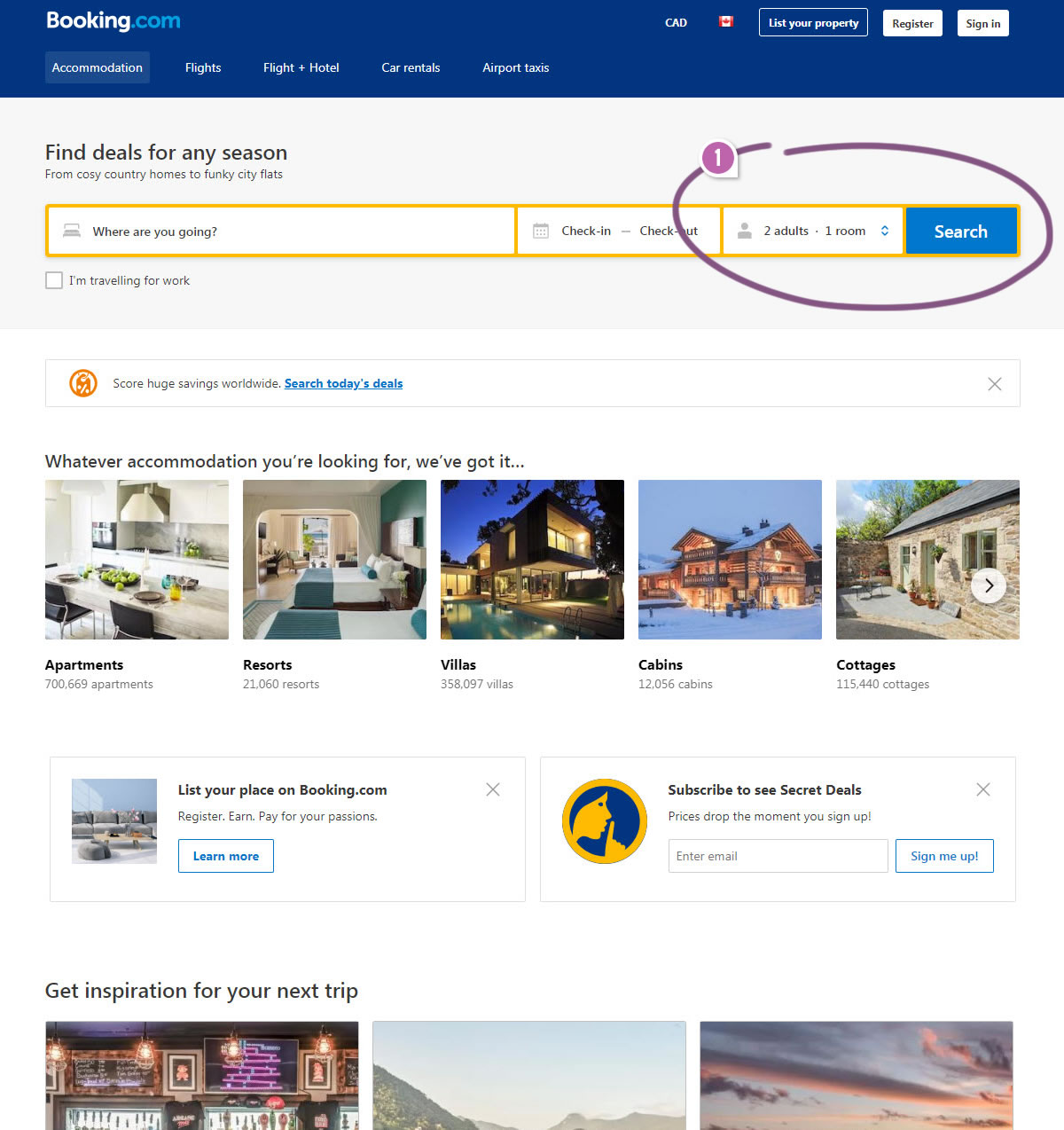
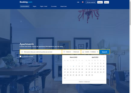
C - Feb 4, 2019 Screenshot
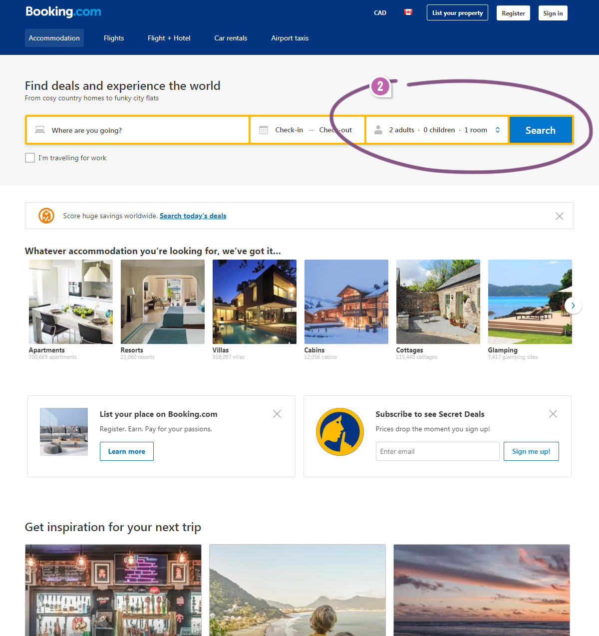
Highlighted UI Changes From This Leak
-
Two Options: Adult & Room Quantities
In this variation Booking hypothesized that instead of showing the "children" quantities in the search bar, it might be better to replace them with "room" quantities instead. Given that this was not rolled out in the end, we're going to assume that this is somewhat inferior to version C that was eventually rolled out.
-
Three Options: Adult, Children & Room Quantities
This second tested version is the closest to our own concept which looks like it was implemented and hence we believe it was superior in the experiment. In this version, all three quantities are being displayed in the search bar: adults, children and rooms.
I find this subtle evidence very interesting in that it hints against the Fewer Form Fields pattern.
This leaked experiment continues to suggest that people might actually be interested in expressing additional answers or search querries. And that the additional friction from being asked to provide another input ("number of rooms" in our case), might be offset by the understanding of obtaining more relevant results on the next step. This would be a perfect example of how a pattern, under specific situations, might have an opposite effect (compare to its general prediciton of encouraging the removal of form fields).
-0.5 Repeatability has been assigned to Pattern #3: Fewer Form Fields as evidence that it's getting worse
Repeatability is a net count of evidence for or against a pattern. It’s how we can predict which patterns are better than others. :)
Two Successful Design Decisions So Far
All in all, I'm really glad that Booking seems to have been inspired by two positive UI changes. Interestingly, the previous leaked experiment and its outcome was also related to a search bar adjustment. Now I'm curious if the remaining concepts will also see experimentation in the weeks or months to come.



Comments