Bol Tests 8 Add-To-Cart Buttons With 1 Winner
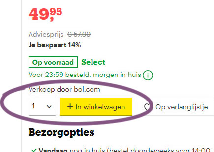
Bol, a leading online retailer in the Netherlands, just completed a beautiful experiment with 8 add-to-cart button variations. Two potentially leading variations (C & G) were then retested in a followup A/B test. Today, we have finally detected that the C version ("In winkelwagen" translated to "Add to cart") has been implemented on all product pages. Here are my comments about some of these variations.


C - Dec 16, 2019 Screenshot

Highlighted UI Changes From This Leak
-
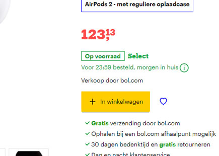
Icon Only Version
Here we can see the icon only button which also turns out to be the smallest one. I have a feeling this might have been the control version although I'm not fully certain (as this is one of the first experiments captured on this screen). Overall, given the amount of evidence from past experiments, I'm not surprised that the smallest and icon-only version didn't make it.
This is very similar to Pattern #2: Icon Labels
This is very similar to Pattern #97: Bigger Form Fields
-
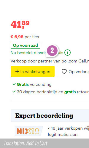
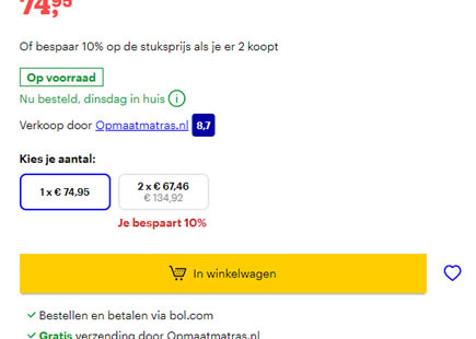
Add To Cart
This version with "Add to cart" label looks like it was implemented It could have been the label, or it could have also been the increased width of the button itself.
-
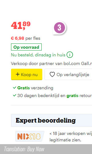
Buy Now
Interestingly this more direct and end-goal oriented label (Buy Now) didn't manage to outperform the more subtle "Add to cart" label. Perhaps an buy or order now is more suited at the end of the purchase process as a final action?
-
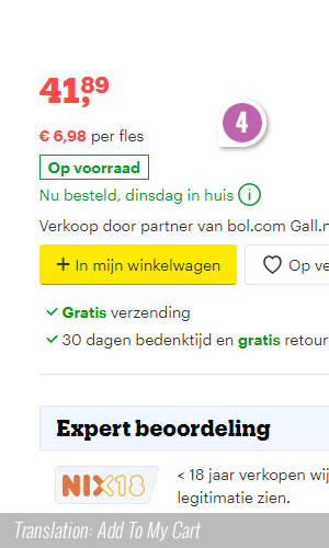
Add To My Cart
The G variation is comparable to C, in that it has the extra word "my" in "Add to my cart". This makes the label wider (which based on past patterns should contribute to a better result). However, when C and G were tested in a follow up experiment, compared to C, the increase size of the G button and the additional "my" did not deliver enough signal to outperform C.
-
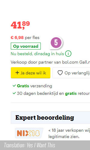
Yes, I Want This
This button label starts with a strong affirmative "Yes". This version did not manage to deliver the best result and was also rejected. The most comparable experiment to this variation is this test with a similar label change (but soon we'll turn this into a separate pattern as we have more expeirments like this in the pipeline). So far, it doesn't look like startign with "Yes ... " is a good idea.
On Confounding Variables - Towards A Better Experiment Design
If we look more closely at this experiment we can see one little problem - it's not just a label change. In fact, all variations in Bol's experiment introduced two variables: label changes AND button size changes. So unfortunately, if we truly wish to infer anything about button labels or button sizes, we have a classic case of confounding here. Assuming we wanted to learn about these variables, a slightly better setup would have been to isolate one change per variant (ex: with a fixed button width).
Grouping multiple changes together is still a good strategy when you already have past data and are designing a bigger experiment to maximize gains.
Comments
Ali 5 years ago ↑1↓1
This is some good reminders, Almost forgot about most of them, Thank you Jakob :)
Reply
Mark 5 years ago ↑2↓1
Significantly, no verb appears in the phrase "In winkelwagen"—it means the equivalent of "shopping cart" (at least in US English usage; perhaps UK usage is "shopping trolley"), rather than "Add to cart." Your translations are mostly correct, but the fact that a verb isn't explicit in the successful (and runner-up) test text is important. Using a concrete word (winkelwagen) rather than the more abstract verbs (buy, order, add, want) and insistent adverb (now) might also be more quickly grokkable.
Here are accurate translations:
B: Order
C: In shopping cart
D: Add
E: Buy now
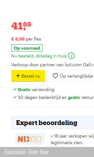
F: Order now
G: In my shopping cart
H: Yes, I want this (one)
Reply
Jakub 5 years ago ↑1↓1
Thanks Mark!
Reply
Geza Fodor 5 years ago ↑1↓1
Do not believe in Google Translator, "winkelwagen" means shopping trolley, not shopping cart. This expression stands maybe closer the physical shopping experience.
Reply