Bol Discovers Something Better Than Classic Pulldown Menus, As Expected
When Bol ran their list vs grid view experiment, they also included a variation that tested for another very simple change: the exposure of menu options. That is, the listing page variant was designed to check if three more visible pull down options would be better or worse than just showing them hidden inside the pulldown. Consisitent with findings from the exposed menu options pattern, the variation was rolled out.
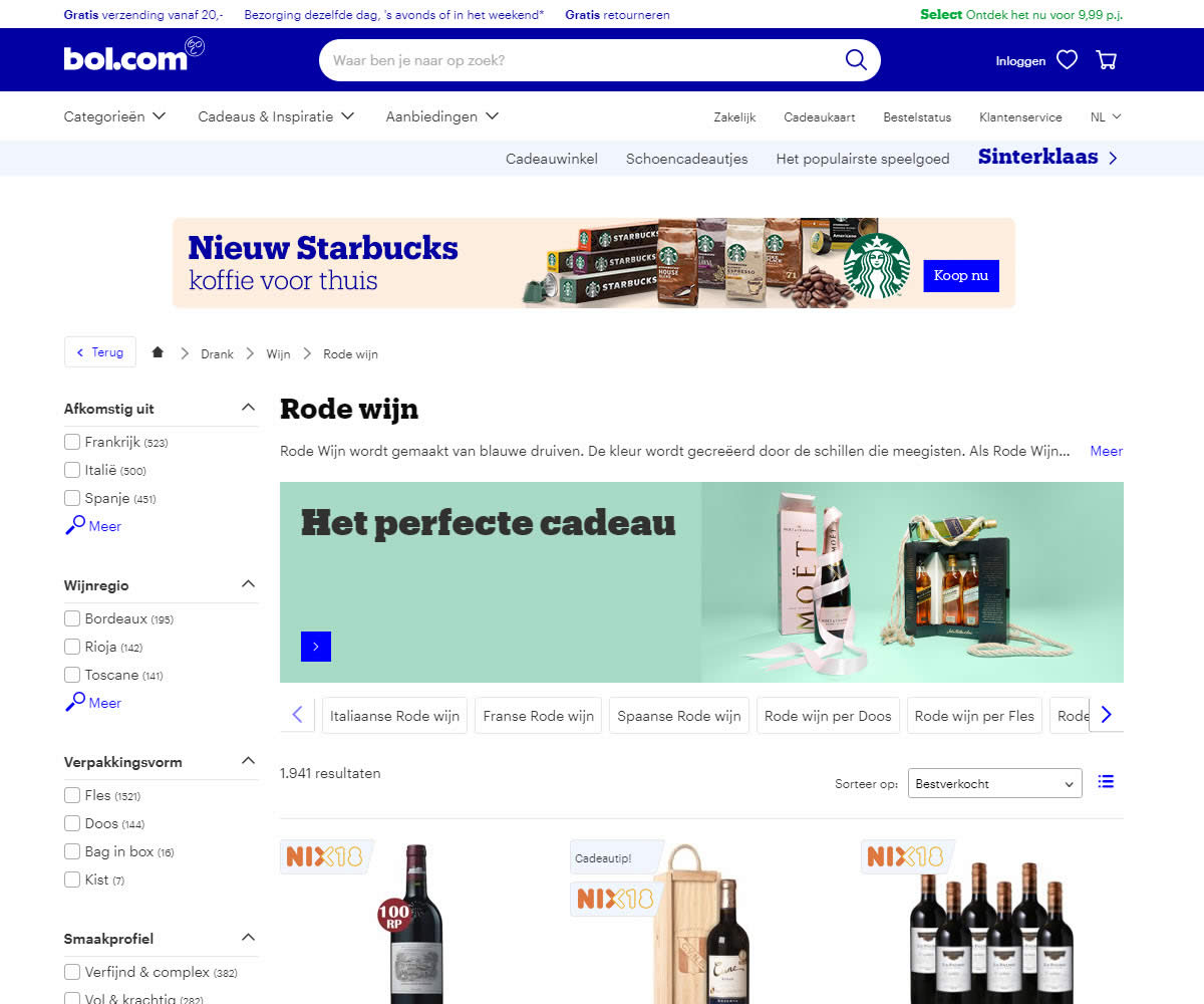
B - Oct 31, 2019 Screenshot
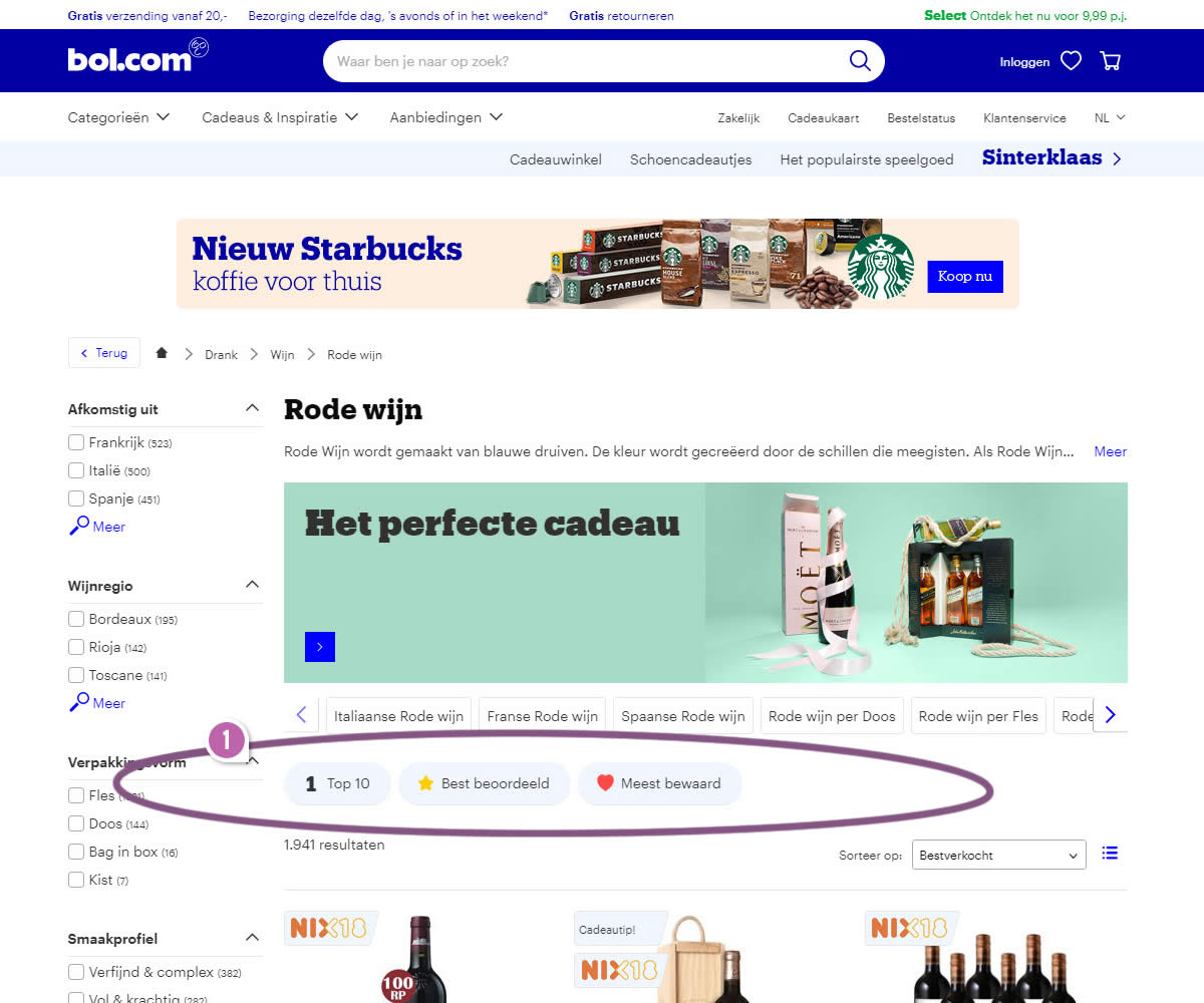
Highlighted UI Changes From This Leak
-
Exposed Menu Options
The A variation only allows to sort results using a classic pulldown menu with such options as: top 10 (most purchased), highest rates and most favorited. The B variation on the other hand took these three options and duplicated them as clickable actions just before the results. This way, the act of sorting results was encouraged and made a little more easier.
0.5 Repeatability has been assigned to Pattern #14: Exposed Menu Options as evidence that it's getting better
Repeatability is a net count of evidence for or against a pattern. It’s how we can predict which patterns are better than others. :)


Comments
Jakub Linowski 5 years ago ↑0↓0
Hey Ivan. I compared the sorting for both the pulldown options and the exposed options and they correspond. For example here is are the Most Reviewed links:
https://www.bol.com/nl/l/rode-wijn/N/36780/?sort=rating1&rating=all (using the pulldown)
https://www.bol.com/nl/t/top-10-rode-wijn/N/36780/?sort=rating (using the exposed options)
They generate the same result. You're right that a slightly different looking (simpler) page is loaded for the exposed options.
Reply
Ivan Burmistrov 5 years ago ↑1↓0
Just checked the live website. These buttons do not sort the product list. They open a different page with top 10 products. I do not think this leak can be categorized as Pattern #14: Exposed Menu Options...
Reply