Bol A/B Tests The UI Classic: List Vs Grid View With A Clear Decision
I am continously interested in answering and providing guidance on whether grid or list views are in general better, worse or indifferent as one of many UI patterns. To my surprise, Bol.com the leading Dutch web shop, has recently a/b tested this classic pattern which we were super lucky to detect on their red wine product listing pages. After anticipating their leaked design decision, we eventually learned that lists fared better for Bol. This of course we'll now use as additional and emerging evidence to tip the scales of probability (and hopefully better predict similar future experiments).
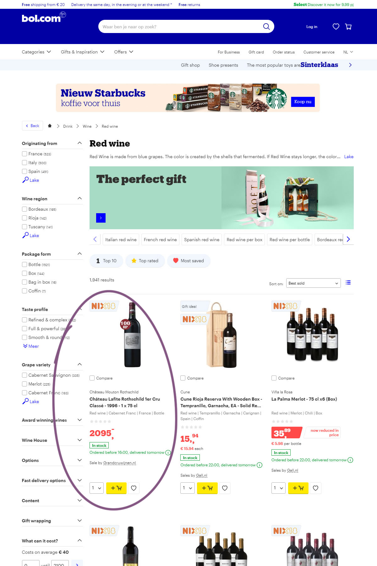
B - Oct 31, 2019 Screenshot
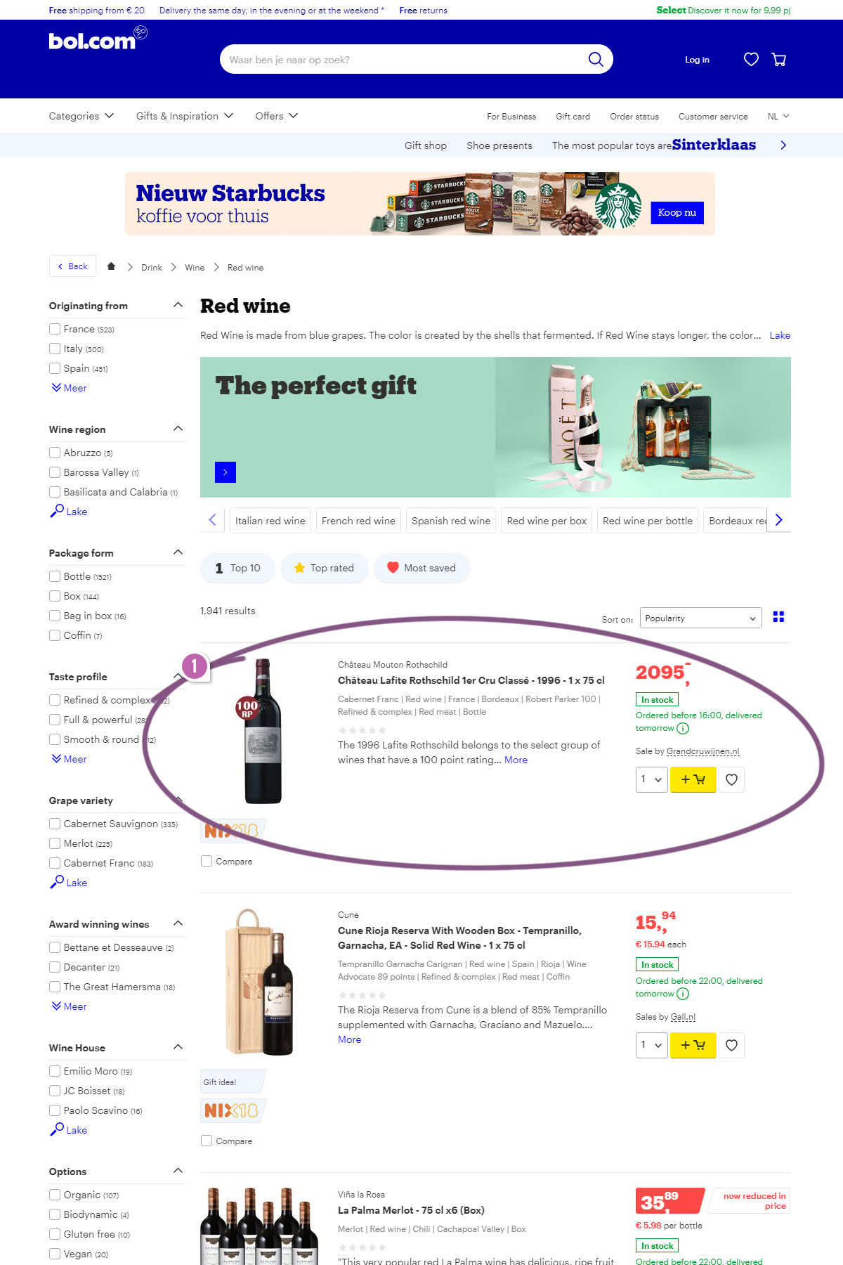
Highlighted UI Changes From This Leak
-
Grid Vs Lists
The B version shows a single-item-per-row list view that has been tested against a three-item-per-row grid. This is a wonderfully isolated experiment where most of the elements between A and B have been kept in tact. There is a slight additional difference where the A version also has condensed the product description under a collapsible link. We're not going to attribute too much weight to this secondary change as we're also tracking it separately in Condensed List pattern here. For the most part, this experiment classifies as a clean grid vs list view change.
-0.5 Repeatability has been assigned to Pattern #37: List Or Grid View as evidence that it's getting worse
Repeatability is a net count of evidence for or against a pattern. It’s how we can predict which patterns are better than others. :)
Answering This Question As "It Depends"
Last week I also asked this same question as a poll on the ConversionXL Facebook group and most people (90%+) answered it as "It depends". Let me say that I am completely open to answering questions at two different levels: the generic and the contextually specific (or conditional). What I really don't like is when people use an "It depends" answer to protect themselves from making any falsifiable prediction / hypothesis - a safe escape mechanism. It depends answers can be really useful if its conditions are made explicit and one person in particular who did elaborate on his answer was Tim Stewart - thank you a thousand for doing this. (Tim by the way also runs an awesome optimization company - trsdigital.) I went through some of his conditionals and I'll try to summarize them as follows:
- IF customers are ready to add-to-cart AND might want to add multiple items then a grid might be better - encouraging more purchases and a greater AOV (average order value).
- IF customers are looking for more information AND might want to purchase a single item then a list might be better due to easier comparisons (assuming more information is needed and presented on the list).
- GENERALLY however, Tom van den Berg from Online Dialogue also hinted that in most of their a/b tests, lists have outperformed grids.



Comments