Bol A/B Tested A More Padded Button
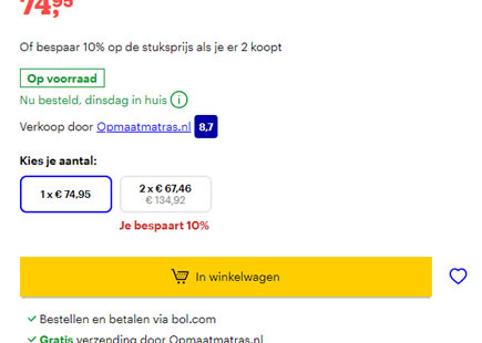
Last year I captured this button experiment from Bol (a leading online retailer in the Netherlands). They tested a smaller button with less padding against a slightly more bloated one. It's now clear that the variation was rolled out completely - consistent with the bigger form fields and buttons pattern.
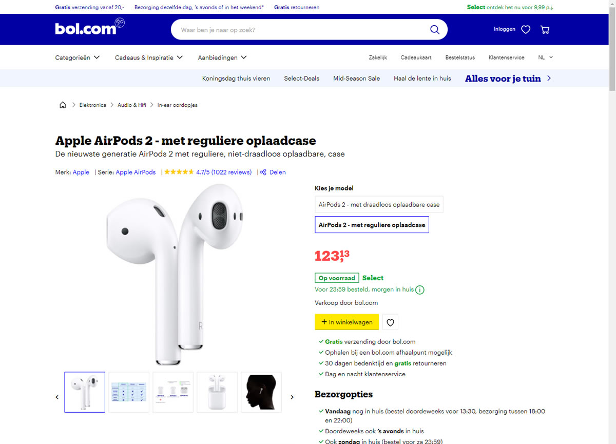
B - Apr 20, 2021 Screenshot
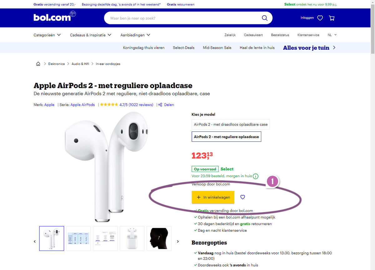
Highlighted UI Changes From This Leak
-
Bigger Button With More Padding
The variation contains a visible button size increase. Equally, the same variation is slightly confounded by an equally subtle color change from yellow to more of an orange yellow. Nevertheless we'll tie this as subtle evidence in favor of larger buttons.
0.5 Repeatability has been assigned to Pattern #97: Bigger Form Fields as evidence that it's getting better
Repeatability is a net count of evidence for or against a pattern. It’s how we can predict which patterns are better than others. :)
Comments