Amazon Finally A/B Tests Their Full Vs. Fixed Width Layout In This Experiment
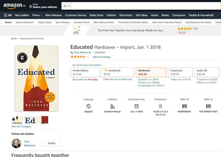
Amazon just completed this wonderful product page layout experiment. The experiment was visible on wider monitors where the main content column was set to either full width (control) or fixed to 1500 pixels (B variation). Personally, seeing numerous product pages stretched to their full width always felt a little odd. Now we know that as Amazon's fixed width experiment finished and was implemented, perhaps such layouts might be a little better than not.
(Also see more e-commerce product screen patterns that have been a/b tested by other companies.)
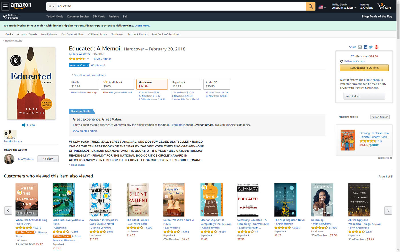
B - Jun 13, 2020 Screenshot
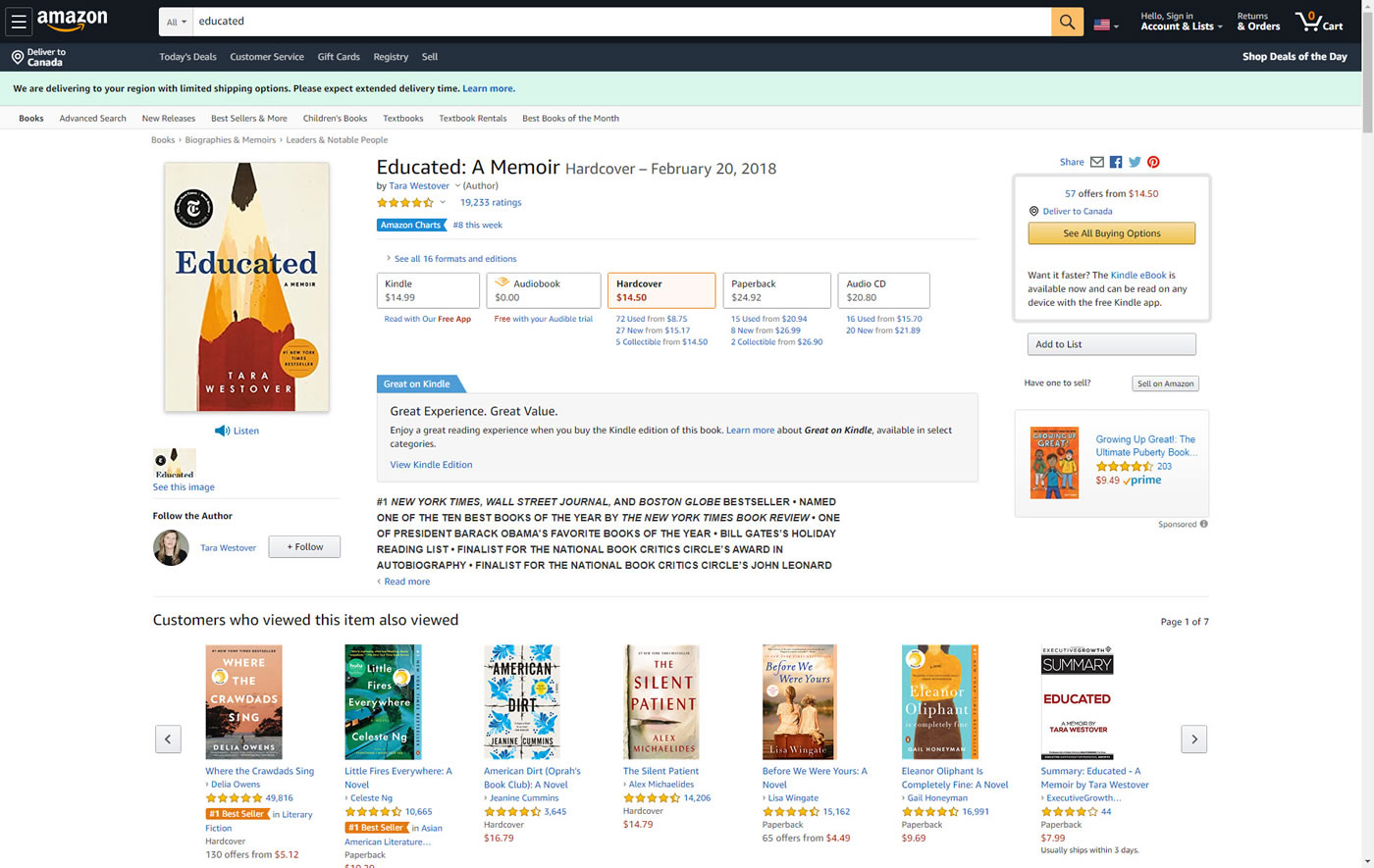
Highlighted UI Changes From This Leak
-
Full Vs Fixed Width Layout
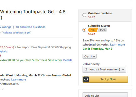
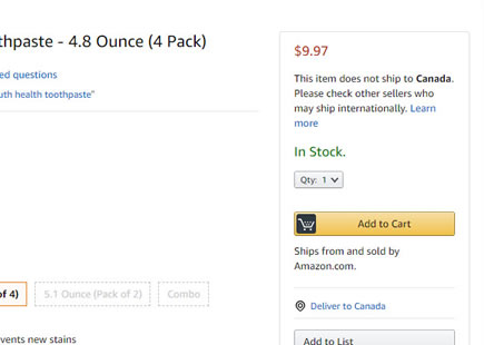
In the B variation the main layout was set to a maximum column width of 1500px. This removed numerous central gaps, and brought the product choices closer together with the add-to-cart box.
This change however also had the consequence of trimming the number of product tiles. Notice how in the control version 10 book recommendations are shown, whereas the B variation only shows 7. Because of this we'll assign negative evidence to the More Results pattern.
Comments