Amazon A/B Tests The List Vs Grid Layout
A month ago I managed to detect this classic list vs grid layout experiment on two of Amazon's product listing pages. I learned that this a/b test ran at least on two random queries such as "tools for mechanics" and "sports gear". Today, the grid layout view now looks like it was implemented - providing some evidence in favor of list vs grid view pattern and more results.
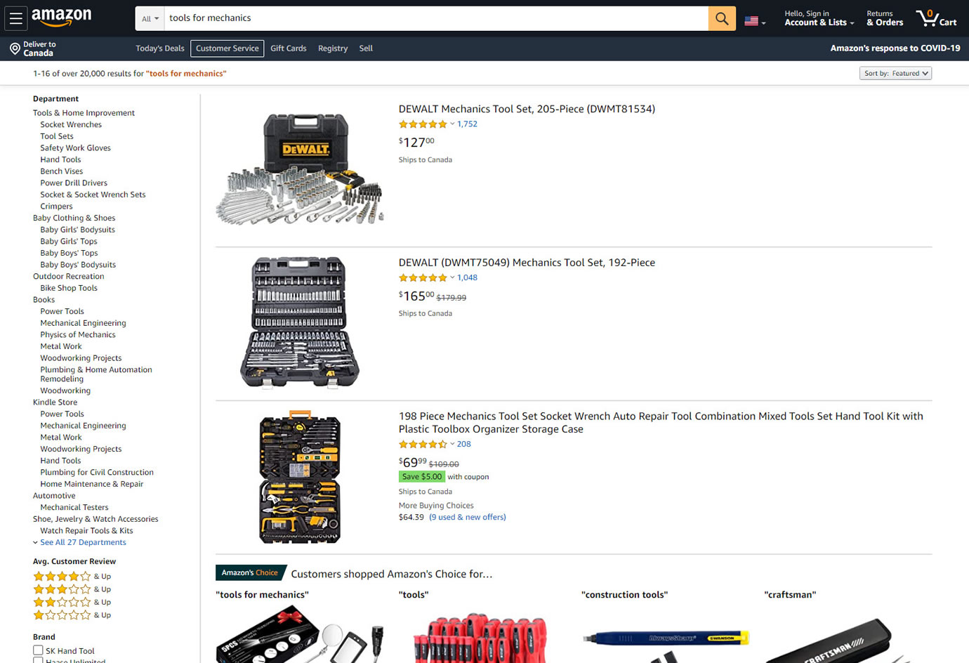
B - Sep 5, 2020 Screenshot
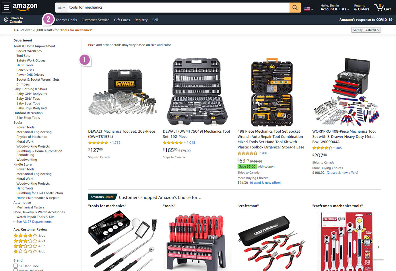
Highlighted UI Changes From This Leak
-
List Vs Grid Layout
Variation B displayed all the same product tile information in a grid instead of a list view.
0.5 Repeatability has been assigned to Pattern #37: List Or Grid View as evidence that it's getting better
Repeatability is a net count of evidence for or against a pattern. It’s how we can predict which patterns are better than others. :)
-
More Results
The number of results was also increased from 16 to 48.
0.5 Repeatability has been assigned to Pattern #36: Fewer Or More Results as evidence that it's getting better
Repeatability is a net count of evidence for or against a pattern. It’s how we can predict which patterns are better than others. :)


Comments