Amazon A/B Tests Bottom Aligned Product Thumbnails
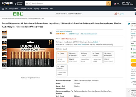
Amazon attempted an image thumbnail experiment on their product pages. Instead using traditional left aligned thumbnails, they shifted them below the main image and increased their size. This is very similar to the left vs bottom thumbnail pattern we started tracking this year. And given the variation was rejected by Amazon, our pattern shifted towards the other side on our evidence scale.
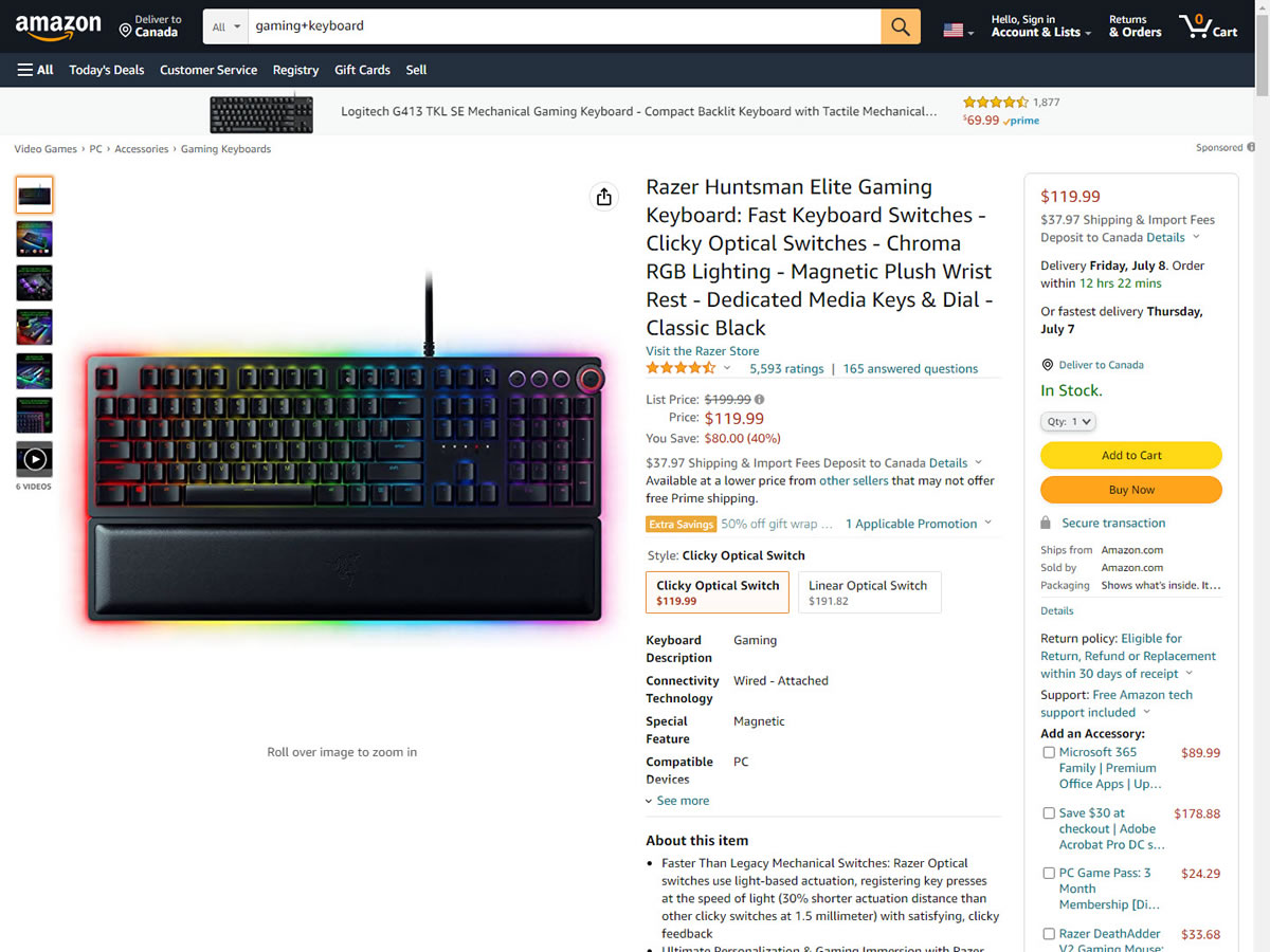
B - Jun 28, 2022 Screenshot
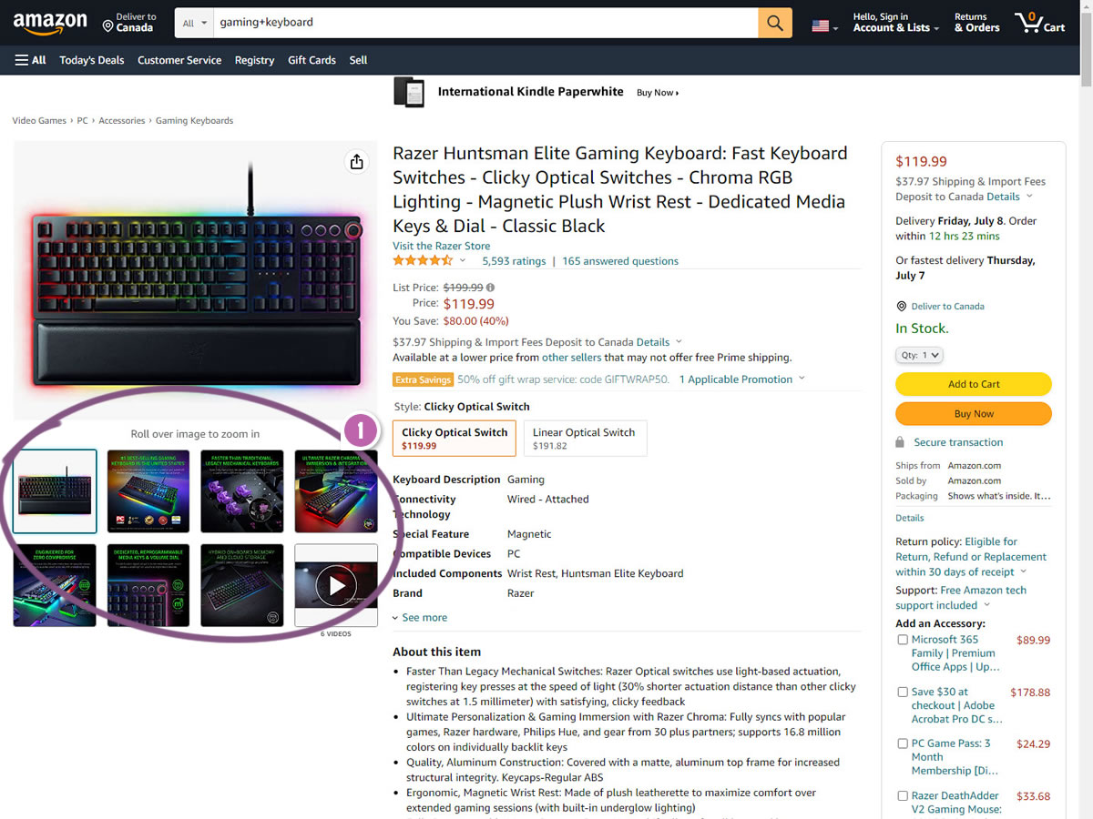
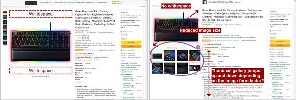
Highlighted UI Changes From This Leak
-
Bottom Alignment, Size and Product Qualifiers
If we look more closely at the variation, we can detect at least 3 key characteristics. First, the position of the thumbnails was shifted below the primary image. Secondly, the size of the thumbnails was increased. And finally, product qualities were also added (ex: "Best selling keyboard in the United States" or "Faster than traditional mechanical keyboards").
If I were to iterate on this experiment, I'd attempt to increase the legibility of this text - as it's highly pixelated and barely legible. :) Also, given Amazon's statistical sensitivity, I would also be curious how a A/B/C/D experiment might look like with all three characteristics isolated separately.
0.5 Repeatability has been assigned to Pattern #126: Bottom Or Left Thumbnails as evidence that it's getting better
Repeatability is a net count of evidence for or against a pattern. It’s how we can predict which patterns are better than others. :)
Additional Analysis From Our Audience
Ivan Burmistrov did an even more thorough analysis right after I posted this leaked test. And here are his shared thoughts with more variables at play.

Comments