Amazon A/B Tests And Rejects Wider And Smaller Product Titles
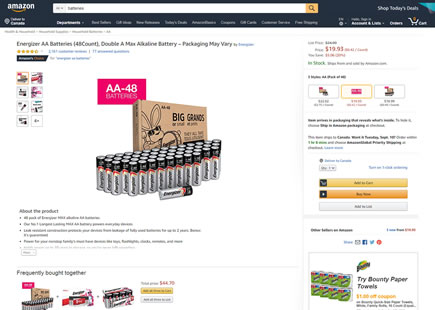
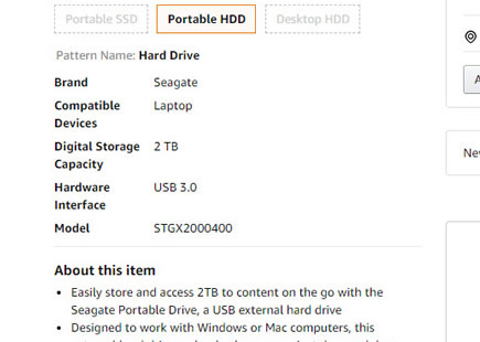
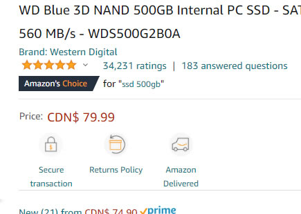
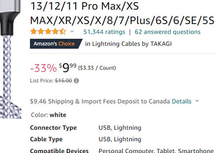
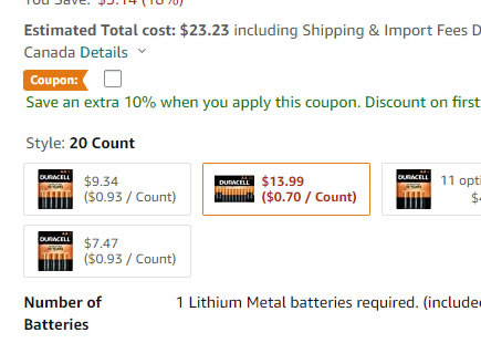
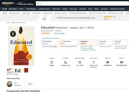
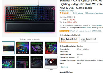
Amazon has been noticed a/b testing their product titles styles with at least 3 variants. The first variation stretched the width of the product title. The second variation decreased the font size. While the third variations combined both changes together - possible checking for interaction effects. Nevertheless, as of today the experiment looks like it completed and all three variations were rejected - hinting at higher optimality for the status quo (the control shown as "A").
What's more, Etsy A/B tested very similar smaller product titles, which were also rejected.
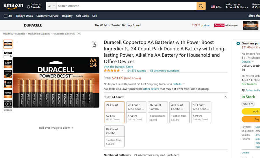
B - Apr 12, 2023 Screenshot
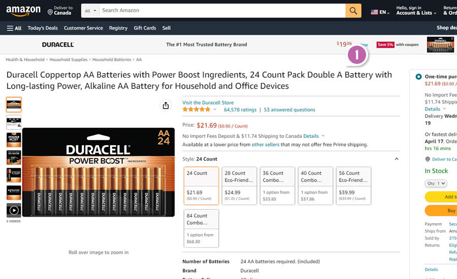
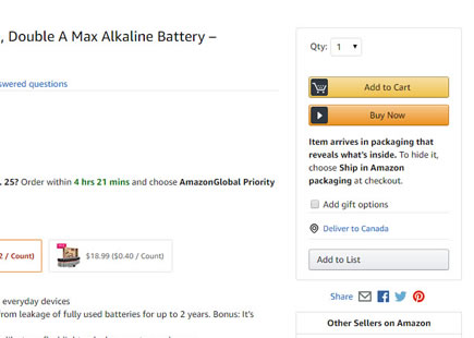
C - Apr 12, 2023 Screenshot
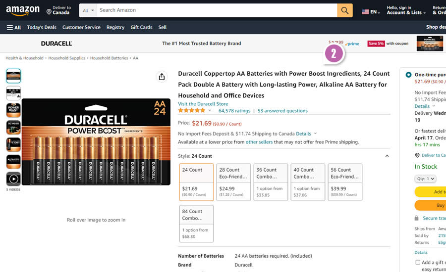
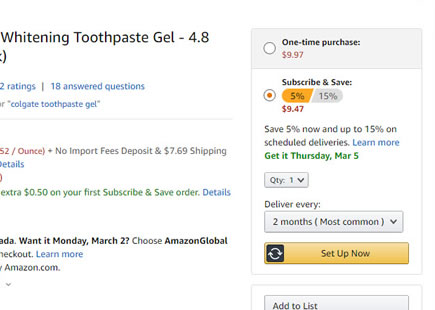
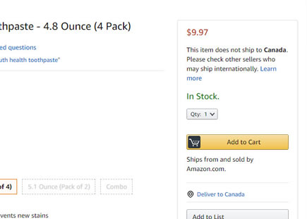
D - Apr 12, 2023 Screenshot
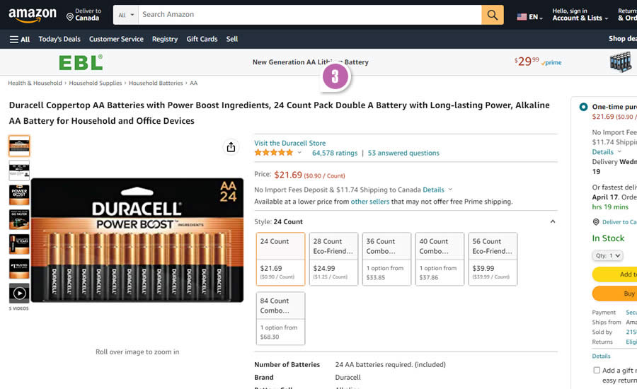
Highlighted UI Changes From This Leak
-
Var B: Wider Product Titles
In this variation we can see a widening of the product title from a the middle column, stretched over on top of the product photo. As a consequence of this, the product photo was pushed downwards.
-
Var C: Smaller Product Titles
Here, the font size of the product titles was decreased.
-
Var D: Wider And Smaller Product Titles
Finally, in this variation both variables (title width and font size) were combined together - possibly checking for interaction effects.



Comments