Amazon A/B Tests And Keeps Both Add-To-Cart And Buy Now Buttons
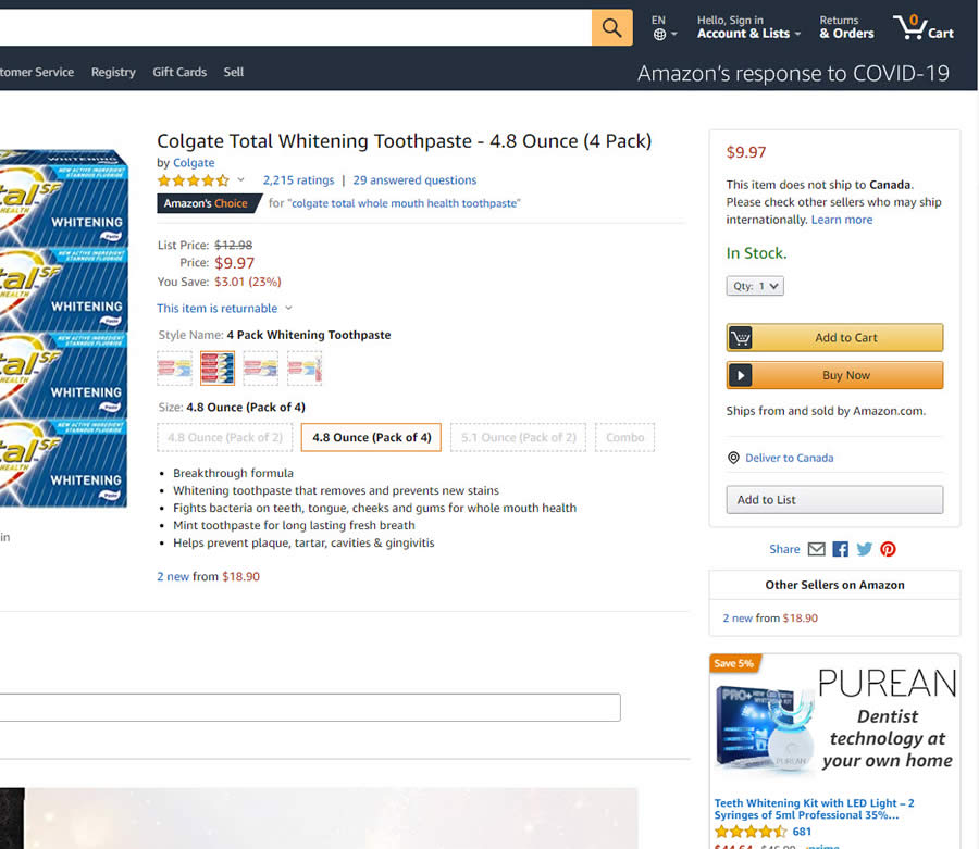
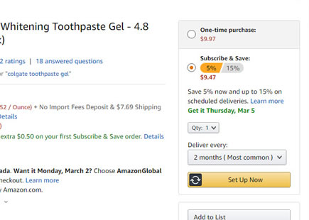
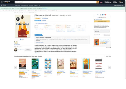
For the longest time I could remember, Amazon's product pages would display two purchase oriented buttons with a very subtle difference. The "Add to Cart" would appear first and move customers into a confirming shopping cart screen with potential upsells. While the "Buy Now" button below would skip the shopping cart and try to send customers one step ahead into a shipping address selection page - essentially a very subtle shortcut.
Two months ago I managed to detect that Amazon was actually a/b testing the removal of the second "Buy Now" button on a specific product page. Finally today it looks like the experiment has completed with both buttons still being displayed - like in the old days. And so, as far as you and me are concerned, we'll count this as positive evidence in favor of shortcut buttons.
A - Mar 27, 2020 Screenshot
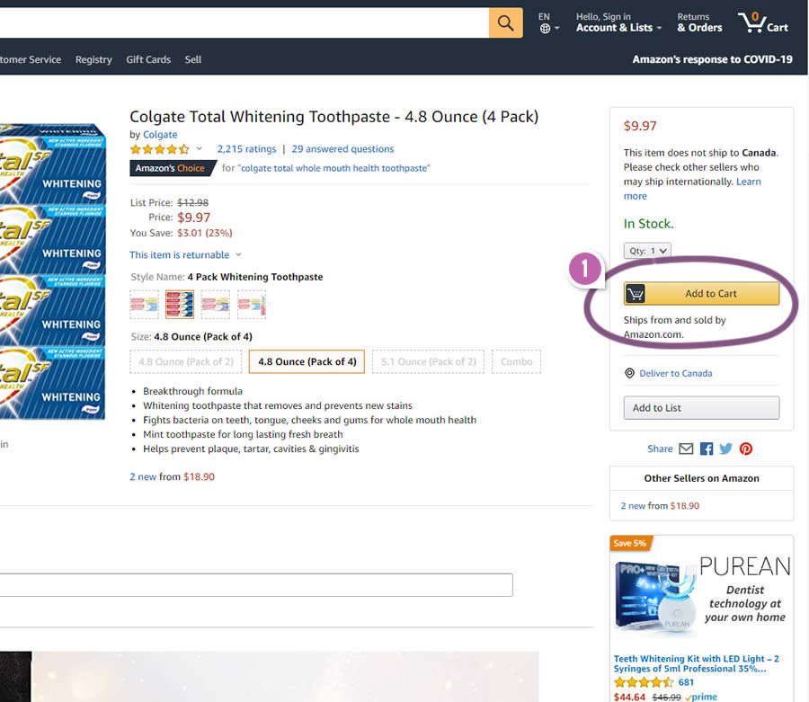
Highlighted UI Changes From This Leak
-
Buy Now Button Removal
The variation shows a product page with only the "Add to Cart" button. Given that the B variation was tested and not implemented, we'll assume that A is probably better.
0.5 Repeatability has been assigned to Pattern #51: Shortcut Buttons as evidence that it's getting better
Repeatability is a net count of evidence for or against a pattern. It’s how we can predict which patterns are better than others. :)
Comments
Ali 5 years ago ↑0↓1
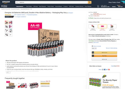
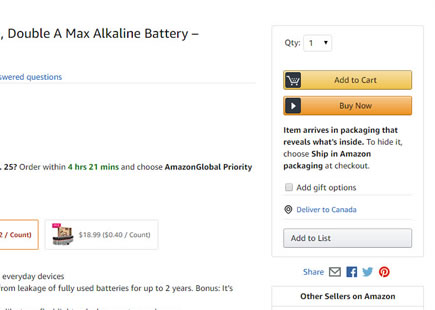
If you are going to buy one product this experiment eliminates the add to cart step and sends you directly to complete your purchase.
Reply
Julien BIJOUX 5 years ago ↑1↓0
The "Buy now" button seems to answer to those problematics :
* Let the user choose (or make him believe) !
* Scarcity you should buy it now because it's available
* Subtle nudge with the arrow icon - to continue just follow the button
* Cart icon is a real enabler : it's a common icon everyone knows,
part of clients might be afraid of the "buy now" because they need to
control all the process
Reply