Amazon A/B Tested This Bigger Price Style
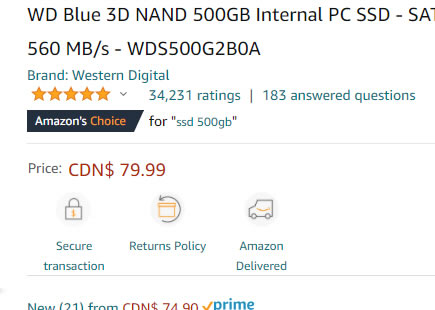
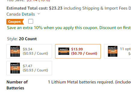
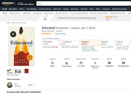
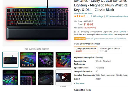
I managed to capture this exciting little big price styling experiment from Amazon before it wrapped up this week. What looks like a small change actually has a few interesting differences packed into a single variation which you can see below. The experiment ran on multiple product pages and now looks like the variation has been implemented - hinting at an improvement.
(We also have a collection of pricing patterns with actual test data.)
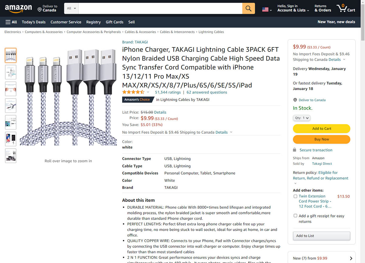
B - Jan 8, 2022 Screenshot
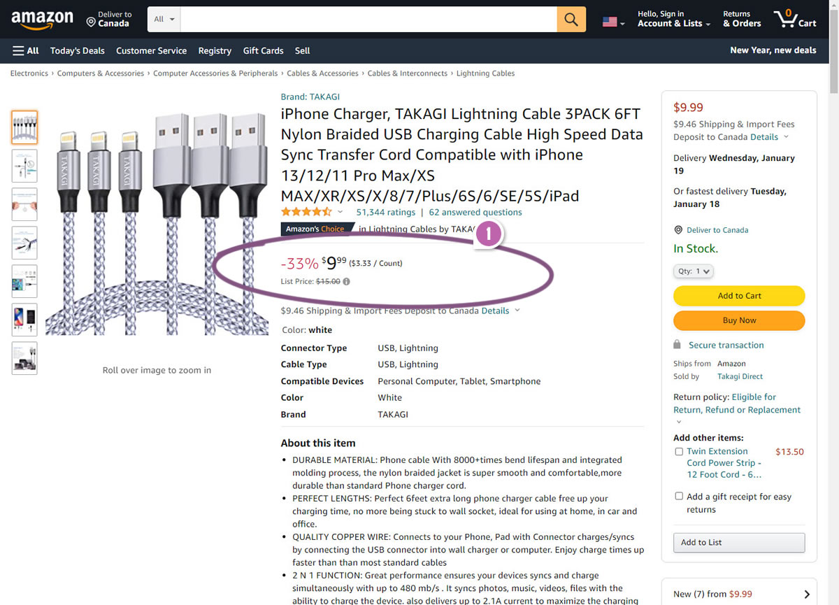
Highlighted UI Changes From This Leak
-
Price Styling Changes
Some of the changes and differences in the variation include:
Larger price totals (the $9.99).
Removed decimal point on the total price.
Larger and preceding relative discount (33%).
Greater color contrast between the relative discount amount (33%) in red and total amount ($9.99).
Lowered strike through list price under the total.
Removal of the total saving amount ($5.01).
Removal of details link. I'm actually not sure where this linked to - possibly a small tool tip.
This is very similar to Pattern #114: Less Or More Visible Prices
Did Etsy Just Inspire Amazon To Do This?
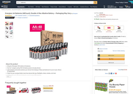
Perhaps it's a coincidence, but Etsy also ran a simple price styling experiment just two months ago. The Etsy experiment also ran on product pages and involved red vs black color styling changes, amongst a few other changes. Not exactly the same but also not very different either. :) Just thought to surface this as well.
Comments
hey 3 years ago ↑0↓0
maybe rollbacked? I checked today, and it shows the A.
Reply
Jakub 3 years ago ↑0↓0
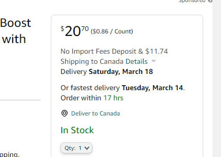
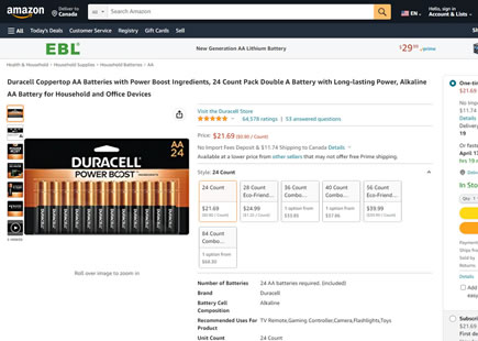
You are right. Checking today it does look like this rolled back for some reason. I've also observed some products being price tested as well. Could be a retest. Could be an incorrect inference on my side. Interestingly, the Canadian site does have products with the new format though: Ex: https://www.amazon.ca/LG-UltraGear-34GP83A-B-Adaptive-Sync-Compatible/dp/B08DWD38VX/ref=sr_1_1?dchild=1&keywords=LG+UltraGear+34GP83A-B&qid=1634405517&sr=8-1
Reply
Ngaire 3 years ago ↑0↓0
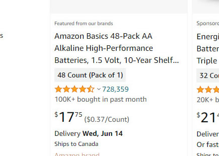
They also made the cent value (99) a smaller font size, presumably to put emphasis on the whole dollar value
Reply
Ivan 3 years ago ↑1↓0
I think the main factor that outweighted all other rather questionable changes is that they finally made the price black.
Reply
Jay 3 years ago ↑0↓0
Feel like it could be more around the increased fontweight of the discount - highlights scarcity and the "bargain" factor, prompting more people to check-out.
Reply