Airbnb Added More Search Cues
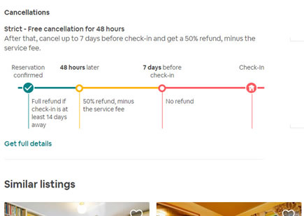
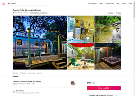
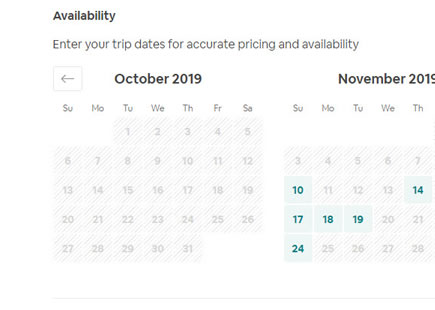
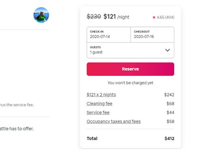
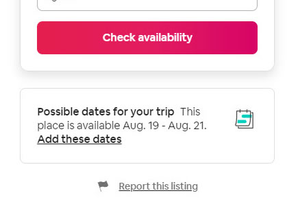
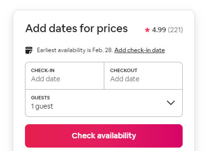
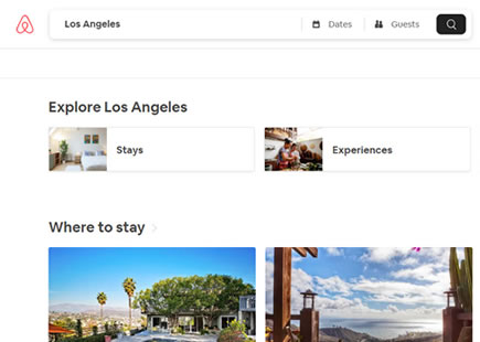
In this leak, three Airbnb property page screenshots with different time frames have been compared. Having done this, it became clear that at least one design decision was made near the bottom of the screen - further confirmed by the final screenshot.
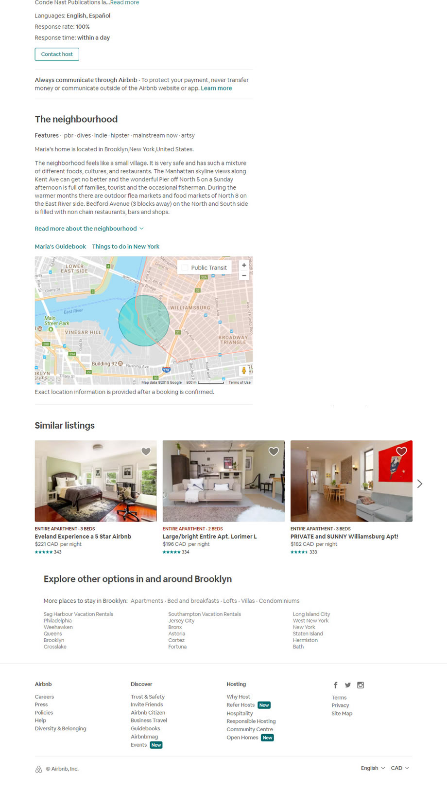
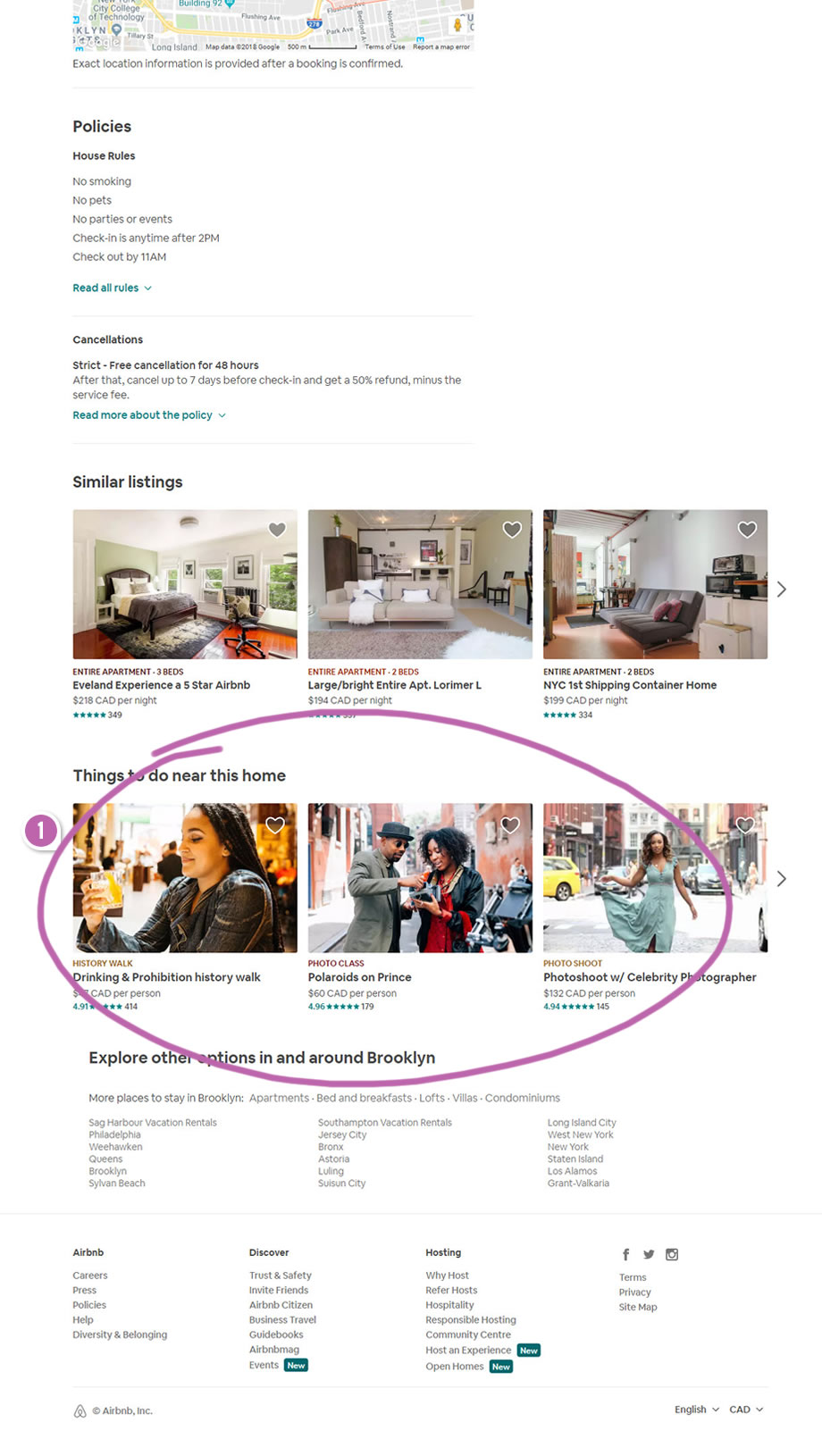
C - Jan 2, 2019 Screenshot
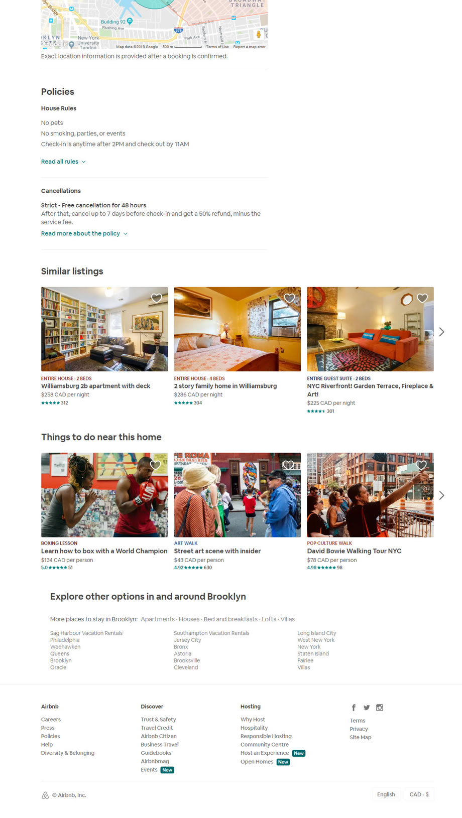
Highlighted UI Changes From This Leak
-
Additional Search Cues
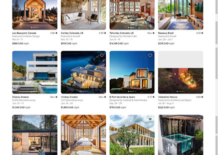
One key change in this leak was the introduction of the additional row of thumbnail images under the "Things to do near this home" category at the bottom of the footer. I'm speculating that these extra sets of "Airbnb experiences" may provide customers with additional reasons to book a property or possible another revenue stream. Although we're not sure if this was a/b tested or simply implemented as a business decision, this design decision still provides subtle evidence worthy of remembering.
Thanks Airbnb. :)
0.25 Repeatability has been assigned to Pattern #79: Product Highlights as evidence that it's getting better
Repeatability is a net count of evidence for or against a pattern. It’s how we can predict which patterns are better than others. :)

Comments
Ivan Burmistrov 6 years ago ↑1↓0
IMHO this example has nothing to do with “Mixed Search Cues”. This is exactly “Things to do near this home” and adding this section increases the value of concrete property. There is the general trend among hospitality websites to provide not only information about the accomodation facility itself but also information about its neighborhood / surroundings and activities / attractions available nearby.
Reply
Jakub 6 years ago ↑0↓0
I guess by Mixed Search Cues I meant a way to continue searching for other related products or experience - possibly in mixed ways. :) Might adjust it in the future if needed. Thanks for sharing.
Reply