Airbnb A/B Tests More Filters On Their Listing Screens With This Outcome
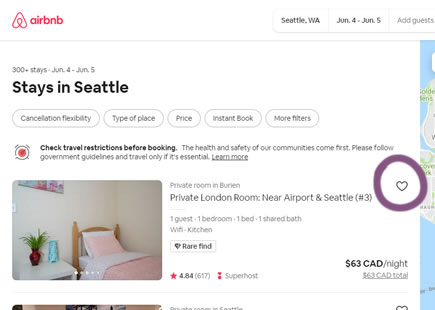
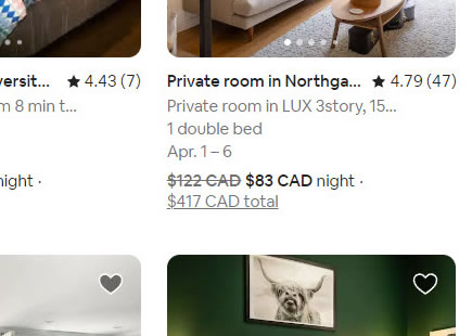
Here is a filter experiment I managed to detect on Airbnb's listing pages a few months ago. At the outset it looks like Airbnb was simply trying to add more filter options, but in reality there are at least three changes confounded together. If we break these changes up into individual patterns we might learn that some of them might be better than others. Perhaps this combination or interaction of both negative and positive changes could be an explanation as to why it looks like the variation was eventually rejected.
A - Jun 24, 2021 Screenshot
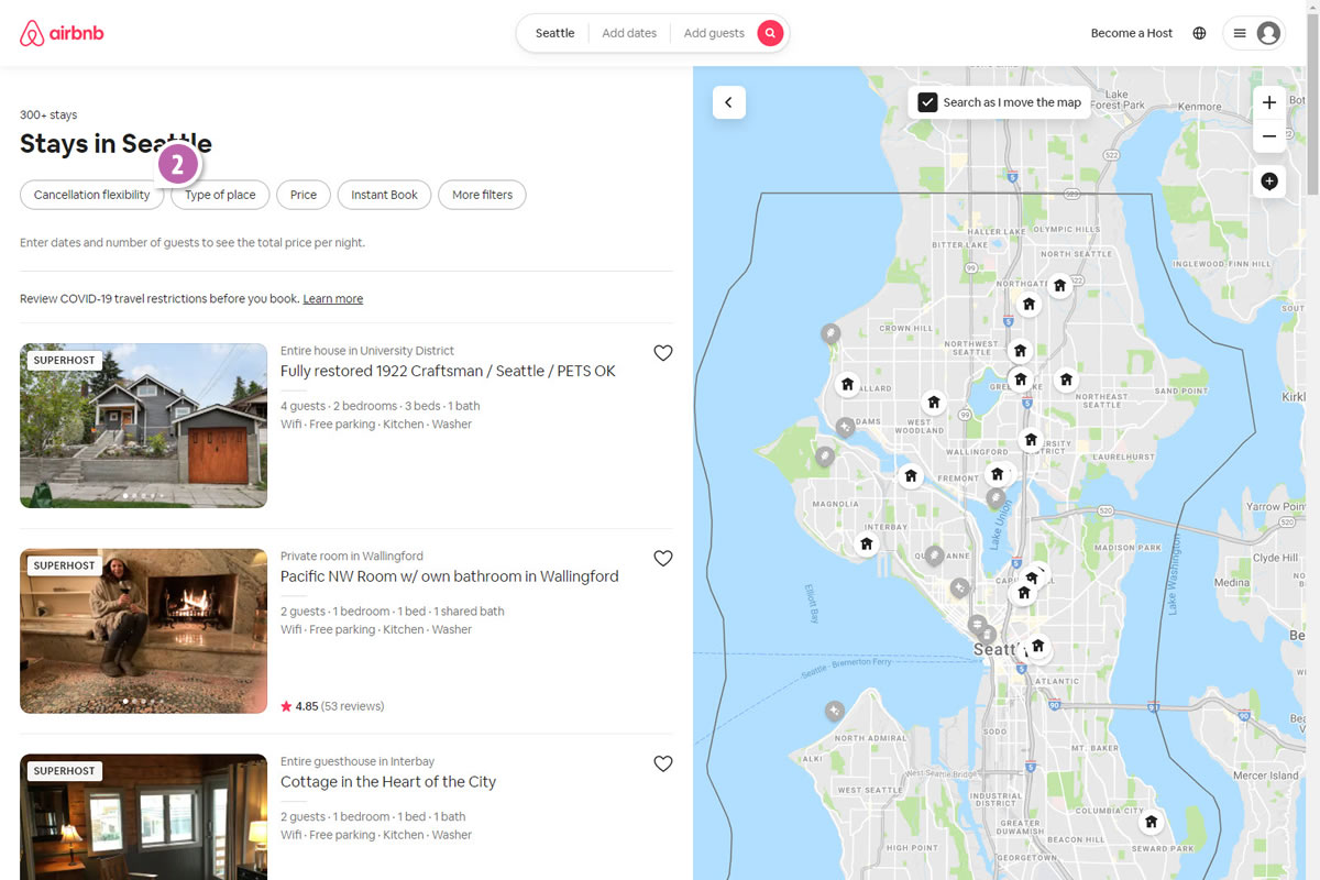
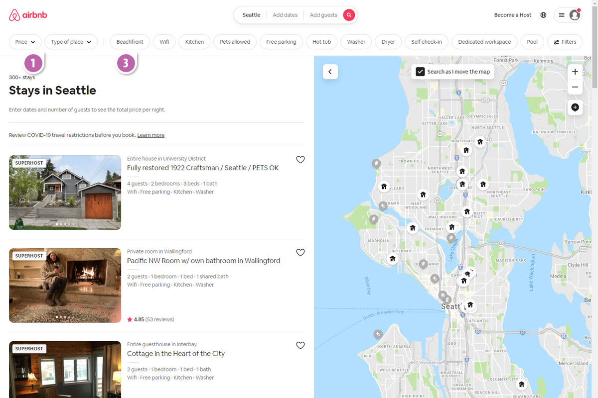
Highlighted UI Changes From This Leak
-
Filter Position Change
In the variation (B) we can see that the filter set shifted higher up away from the listing, closer towards the top or peripheral part of the UI. Perhaps the designer of the experiment did not want to break the filter set onto multiple lines while expanding its width? Whatever the reason I'm wondering if this change alone decreased the overall amount of engagement as the more central filters feel more visible.
This is very similar to Pattern #13: Centered Forms & Buttons
-
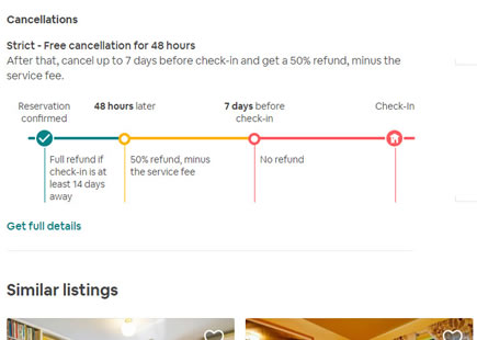
Removal Of Cancellation Flexibility Option
Variation B also seems to have removed (or hidden) some filter options such as the already prominent "Cancellation Flexibility". If we make an assumption that this was an important choice that was removed, then this could be tagged as a negative change. In past experiments we have observed that customers might wish to delay their payment decisions if given the option - and finding properties with cancellation options might be similar to this.
This is very similar to Pattern #46: Pay Later
-
More Filter Options
Last but not least, the variation also expanded a number of filter options more visibly. Usually in past experiments we have seen this change or pattern to work better than not.
This is very similar to Pattern #14: Exposed Menu Options

Comments