Airbnb A/B Tests And Discovers That A Higher Button Position Is Better
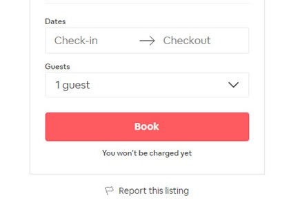
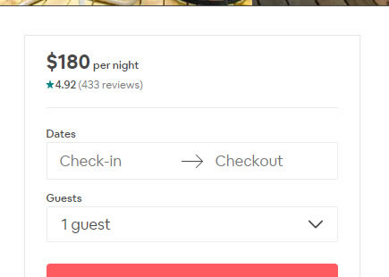
Airbnb ran this wonderful experiment on one of their primary reservation buttons. The A/B test adjusted the position of the button, shifting it higher on all property pages - which was implemented once ended.
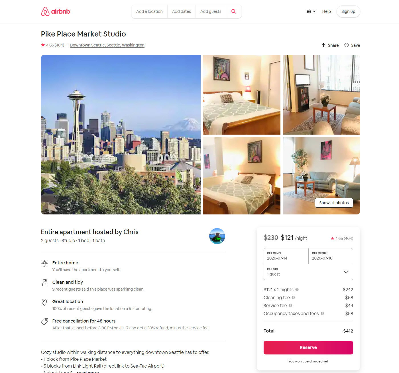
B - Jun 11, 2020 Screenshot
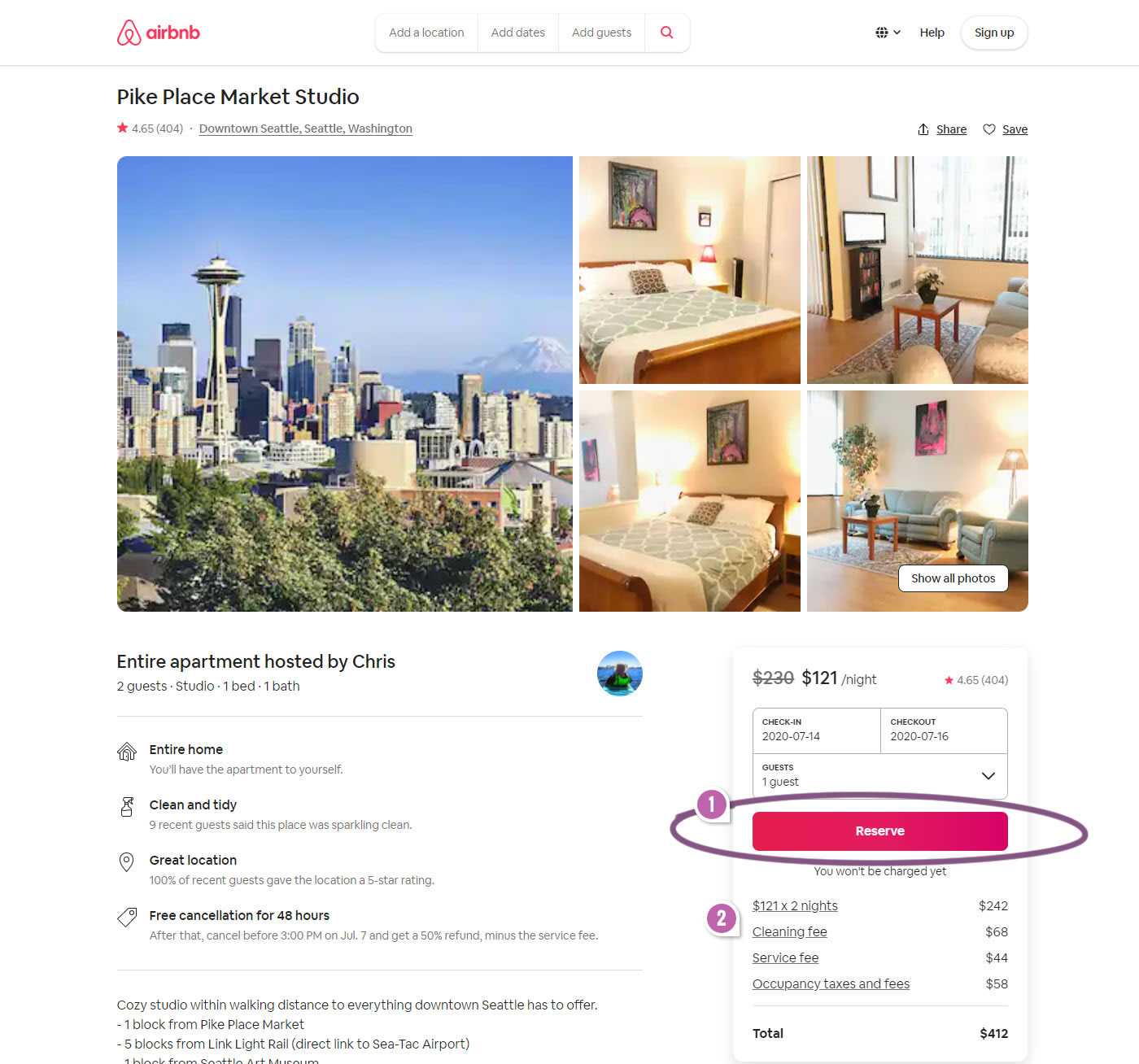
Highlighted UI Changes From This Leak
-
Higher Button Position
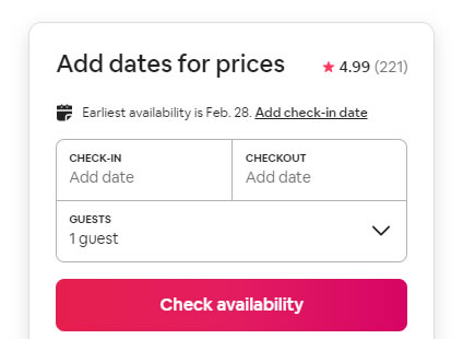
In variation B, we can see that the "Reserve" button's position was shifted above the pricing summary and below the calendar picker. I'm going to interpret that this was the primary change which most likely carried the positive impact (inferred by the final implementation decision).
We can make this guess because we have other similar A/B tests (with positive effects) that also made call to action buttons more visible by shifting them above the fold.
0.5 Repeatability has been assigned to Pattern #49: Above The Fold Call To Action as evidence that it's getting better
Repeatability is a net count of evidence for or against a pattern. It’s how we can predict which patterns are better than others. :)
-
Underline Styling For Price Tool Tips
Furthermore, variation B also introduced a subtle styling adjustment. Notice how the price summary styles were changed from classic icon tool tips towards underlined text links. On this particular change, unfortunately I don't have any past patterns or data to share.
If I had to guess, perhaps the underlined links might have slightly encouraged more people to click on the links to clarify potential uncertainties - possibly a good thing? But again, this is a wild guess.
Comments
Alfonso 5 years ago ↑1↓0
Leaving aside what I believe is taking unfair advantage of the anchoring cognitive bias by putting the button next to the first (and lower) price shown, what worries me are the usability implications of the second change.
Tooltips make it clear that you will not leave the page you are viewing. Links imply you will leave to another page. It would help having at least some sort of icon indicating that clicking would open a pop-up or modal window... But then it would have made more sense to enlarge or change the colors of the existing icons.
Reply