Airbnb A/B Tests And Detects A Better Placement For Saving Properties
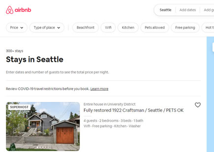
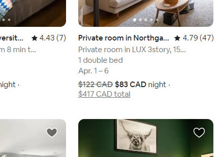
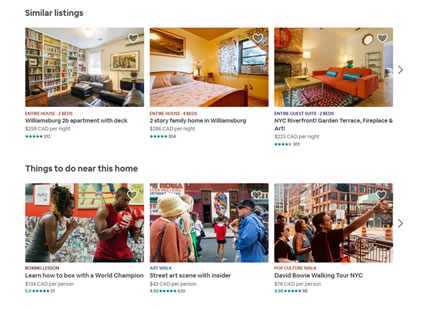
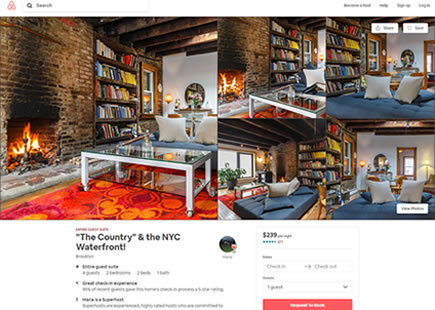
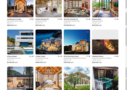
It looks like Airbnb just discovered a better placement for the "heart icon" that allows users to save properties to custom lists. Instead of placing the icon directly over property thumbnails (as in the control), it was A/B tested with a rightmost position of a wide listing - and eventually implemented. This might be a tiny change, but a few possible explanations came to mind as to why this turned out the way it did.
(We also have other effective patterns that have been tested on listing & search results screens.)
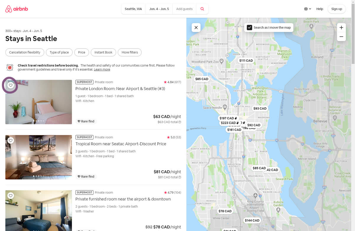
B - May 4, 2020 Screenshot
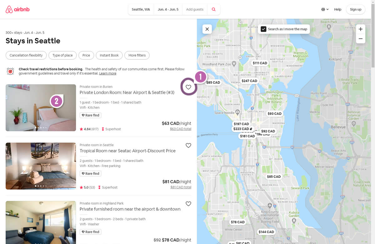
Highlighted UI Changes From This Leak
-
Icon Position Shift
Variation B shifted the save icon from over the thumbnail towards the right of the listing tile. Could this have lead to some measurable gains? If so, here is one hypothetical explanation:
Possible Explanation: More Central Position. Perhaps a more central position of the icon made it easier to interact with and save more listings. If we assume that while users scroll down a page their cursors are somewhere in the center or right of the screen (ex: near the scroll bar), having a functional save icon closer to the cursor might bridge the spacial gap - and require less time according to Fitt's Law. In other words - having functions on the very left of the screen could make them more distant and harder to interact with (would be great for someone to double check this).
-
Unobstructed Thumbnails
As the icon shifted to the right, the thumbnail image became more visible and less obstructed. Could this have had some positive effects?
Possible Explanation: More Visible Thumbnails. Perhaps this simply means that more visible property images without any overlapping elements provide users with a better preview image that helps with their decision making. Although the overlapping icon was tiny, perhaps in some edge cases it hid some key visuals and lead to an inferior experience.
Possible Explanation: Fewer Errors. We might also notice that both the save icon and the thumbnail photo have unique functions assigned to them. The icon saves a listing, whereas the thumbnail leads to a property detail page. Perhaps when these two were being overlapped, it lead to more accidental clicks and unintentional results (ex: users trying to save but accidentally clicking on the thumbnail and going into the property itself, or vice versa).
Share Your Own Explanation
Clearly I've reverse engineered some of these explanations in a post hoc sense without actually seeing Airbnb's test result. So these explanations are more like forward hypothesis for our own future experiments to come. Nevertheless, if you have any other thoughts as to why variation B might have been better (since it was implemented after testing), then please share your comment. :)





Comments
Rob Spangler 5 years ago ↑0↓0
Great insights. I like this test leak, as we have a similar client function.
I also wonder if it could be an issue of identity. Are users favoriting this place based on the photo, or the title/details? This implementation could suggest that people think the latter.
Reply
Erik S Nef 5 years ago ↑0↓0
Thanks Jakub for your always compelling field observations dialogue. I have a theory I'd wanted to share about Airbnb's motives. I agree with your possible explanation that being more proximal to the center of the screen is an ergonomic improvement. I think that placement was also an improvement because of how our brains subconsciously associate elements that are proximity to one another - that they're directly associated. I bet that some users were less willing to favorite items because subconsciously they weren't sure if that heart was to favorite that specific image rather than the listing as a whole. I am also pretty sure that it was an improvement because of when the decision to favorite an entry happens - after reading the body of the list item. English is left-to-right, to logically, the favorite action would often happen after reading the description, so it's where they're already looking. Fascinating stuff!
Reply
Anya Kern 5 years ago ↑0↓0
Seems like on mobile they kept the favorite icon on the image on the right side, which leads me to assumption that shift to the right side of the screen makes it easier to interact both on mobile and desktop. Btw would love to see more mobile leaks on good ui!
Reply
Paul 5 years ago ↑1↓0
I think the favorite icon has a better chance of getting lost on top of the thumbnail - especially if the photo has a light area in that space. With the new approach, they have control over the contrast and it is consistent.
Reply
Alfonso 5 years ago ↑0↓0
Also de error rate when clicking or touching on the image will surely decrease. No more undesired actions (and thus frustrations that lead to bad user experiences) like saving when you really only want to have a closer look.
Reply
Adam 5 years ago ↑1↓1
I think moving the star rating closer to the photo helped since that's what people want to know. If they tried putting the star rating ON the photo it might do even better. The "heart" icon was just in the way and might not be what's actually relevant here.
Reply