Airbnb A/B Tested These 3 Button Labels And They All Failed
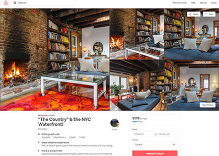
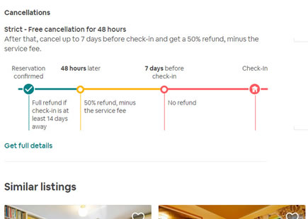
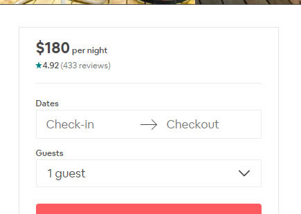
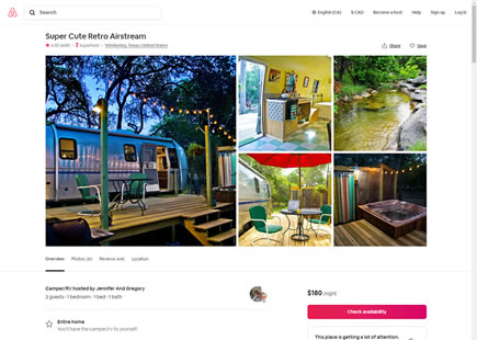
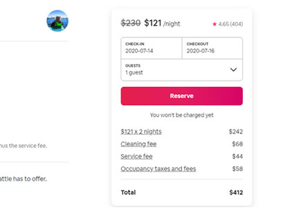
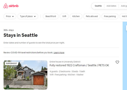
Button label tests are easy to setup, including this one that Airbnb ran on their property listing pages. In total we detected that they a/b tested 3 variations against the original control. One month later, all treatment variations were rejected suggesting that the "Reserve" button defended its superior performance.
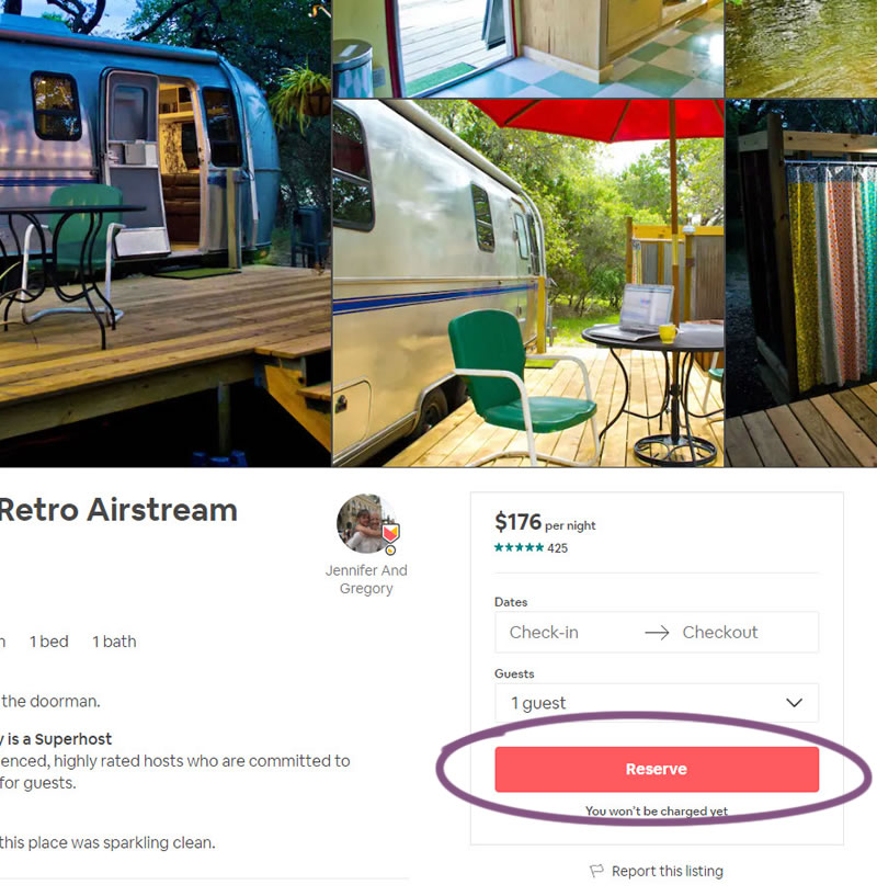
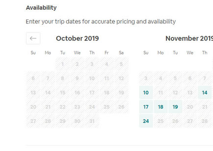
B - Jul 22, 2019 Screenshot
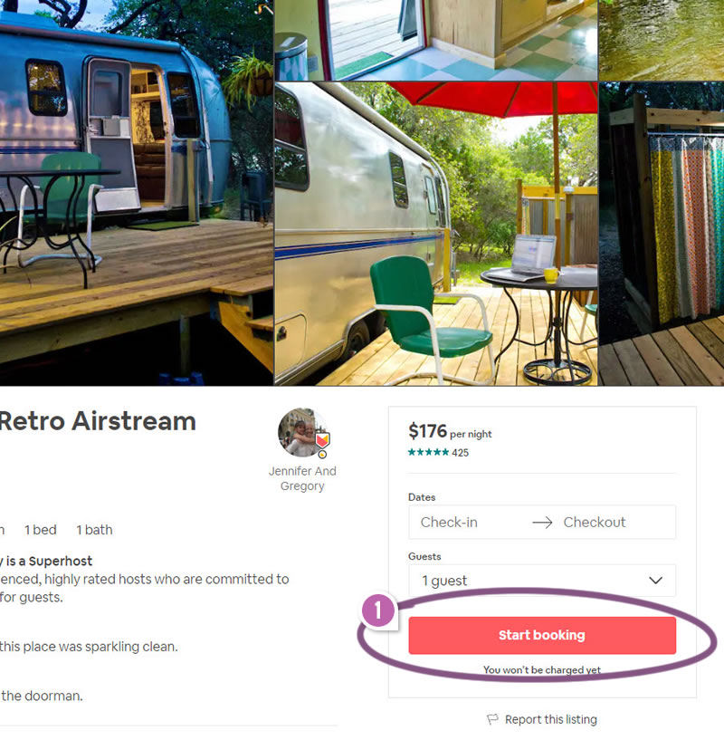
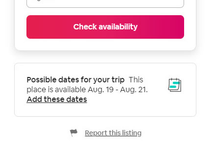
C - Jul 22, 2019 Screenshot

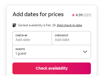
D - Jul 22, 2019 Screenshot
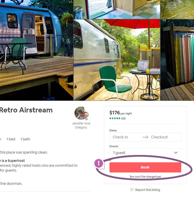
Highlighted UI Changes From This Leak
-
Reserve VS. Book
It looks like the "Reserve" button outperformed such variations as "Start booking" or "Book" - why? Could it be that "Reserve" hints at the benefit of obtaining a hold on a property (with or without payment)? Whereas the "Booking" button, although equally contractual and committal, might feel a little less like a guarantee (which I think might be the core benefit).
0.5 Repeatability has been assigned to Pattern #85: Benefit Button as evidence that it's getting better
Repeatability is a net count of evidence for or against a pattern. It’s how we can predict which patterns are better than others. :)
-
Reserve VS. Continue
It also looks like "Reserve" outperformed "Continue" for a similar reason. It could be that the "Continue" button doesn't convey a benefit at all. Instead the benefit of performing the action has to be inferred from the rest of the copy on the property page. "Continue", although non-committal, is very neutral and abstract.
Comments
Tristan 6 years ago ↑1↓0
I think an additional benefit of 'reserve' vs the alternatives is that 'reserve' implies scarcity. When you read 'reserve', FOMO is triggered and you’re more likely to act now to secure your apartment because there's a sense of urgency. (After all, we've all missed out on something at one point in our lives.)
The alternatives, by comparison, imply there's absolutely no rush to secure the apartment.
Reply