Bol A/B Tests A Bigger Add-To-Cart Button That Is Rejected
After detecting some success with a more padded button, Bol continued their a/b test iteration. The Dutch online retailer ran an experiment with an even wider add-to-cart button on their product pages. This change however seems like it wasn't good enough and was eventually rejected. Could the "saving" or "favoriting" function have been pushed too far out?
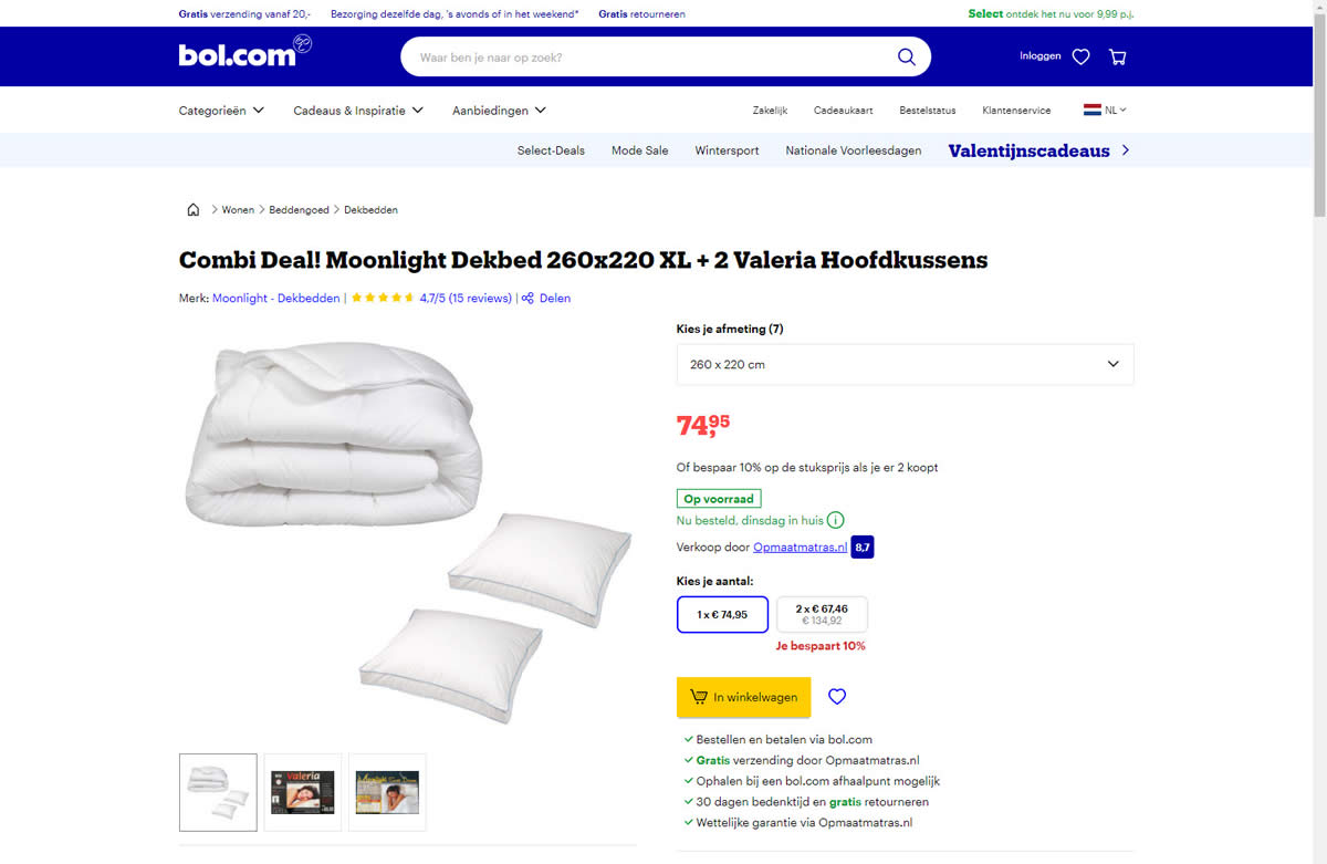
B - Feb 4, 2022 Screenshot
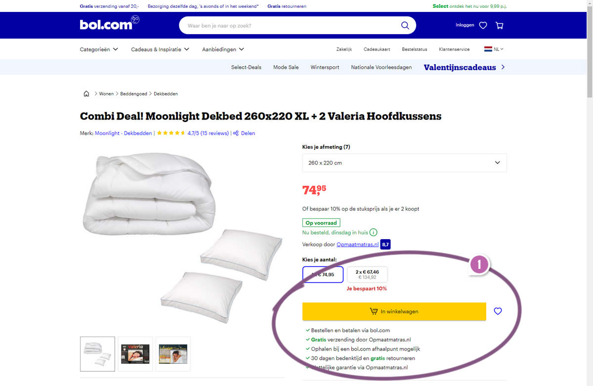
Highlighted UI Changes From This Leak
-
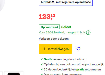
Wider Add-To-Cart Button
Here we can see a clear widening of the add-to-cart button in the B variation. Usually such changes have lead to positive results as visible in this pattern.
However, Bol seems to have rejected the variation, hinting that it either wasn't good enough on the primary metric (with a flat or negative result). Or perhaps the test lead to a negative outcome on a secondary or leading metric - such as favoriting, perhaps?
These of course are simply speculations as we don't have access to Bol's test data.
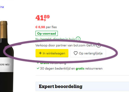
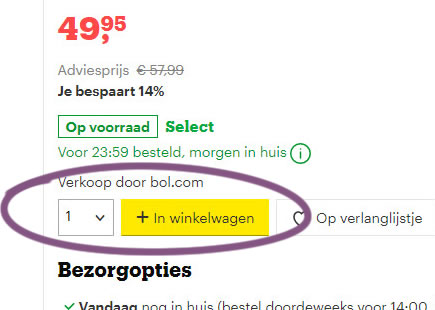
What we have however are at least two possible experiments that directed user's attention to saving functions (as a stepping stone towards account creation). Perhaps a larger add-to-cart lead to fewer favorting interactions?
-0.5 Repeatability has been assigned to Pattern #97: Bigger Form Fields as evidence that it's getting worse
Repeatability is a net count of evidence for or against a pattern. It’s how we can predict which patterns are better than others. :)
Comments