Discover UI Design Decisions Of Leading Companies,
From Leaked Screenshots & A/B Tests.
Showing 112 results
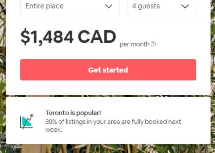
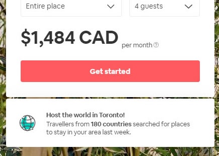
Airbnb A/B Tests And Rejects Both Of These Social Proof Statements
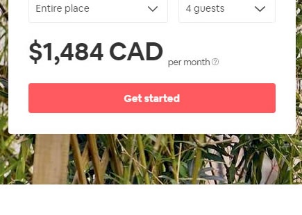
Many companies have already tried and tested the pattern of displaying numerical social proof in some form or another. In this leaked experiment from Airbnb on their host signup landing page, we managed to detect two social proof statements that were eventually rejected. Here are some potential explanations as to possibly why they failed to deliver on an improvement. View Leak
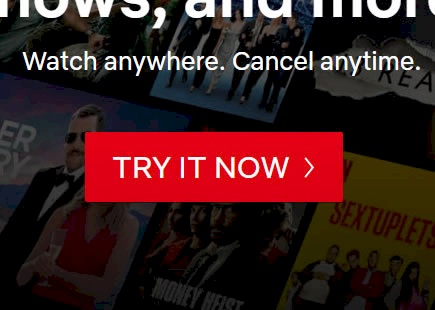
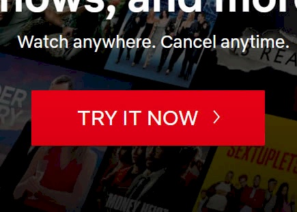
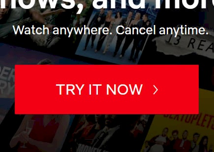
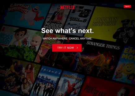
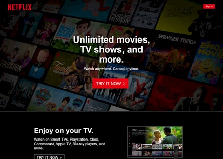
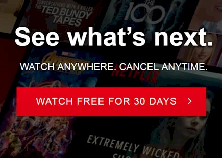
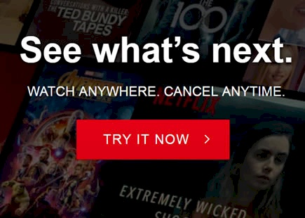
Netflix Designs Their Button A Little Too Big
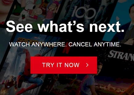
Sooner or later design properties should reach optimums for their given contexts. That is, UI elements will become just right - not too big and not too small, or not too high and not to low, etc. In this leak, it seems that Netflix has approached such an optimum when they tested various button sizes on their landing page. Given that form elements and buttons should generally be bigger, it was inevitable for this new evidence to appear as an example of a button being simply too big - as seen in this beautiful experiment. :) View Leak
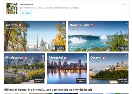
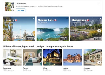
Booking's Homepage Carousel Experiment Fails As Predicted
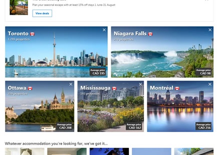
I was glad to detect this carousel experiment that Booking recently ran on their homepage because we've already seen similar experiments fail in the past. Instead of showing 5 location tiles, they tested a version that only showed 3 tiles at a time with an ability to slide for more - a carousel. It wasn't the automatic slider type that would unleash the wrath of Karl Gilis, but it was a user-invoked slider nevertheless. View Leak
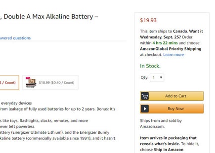
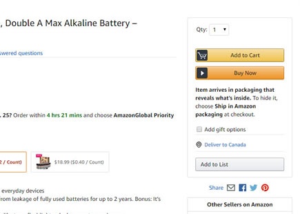
Amazon Discovers That Product Availability And Price Belong Closer Towards Add To Cart
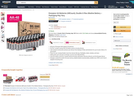
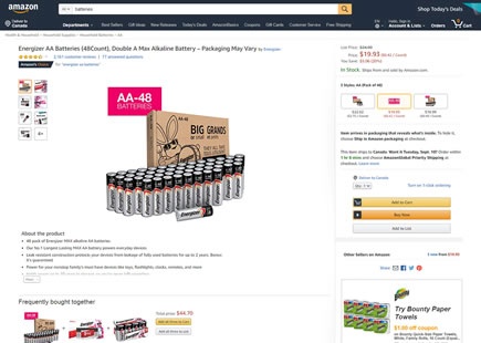
In this little experiment, Amazon shifted the availability information towards the center of its product pages. Instead of showing if and when a product will ship near the right add to cart tile, it was moved towards above the product description. Some weeks later, we discovered that this change was rejected in favor of showing the same information in the top right. View Leak
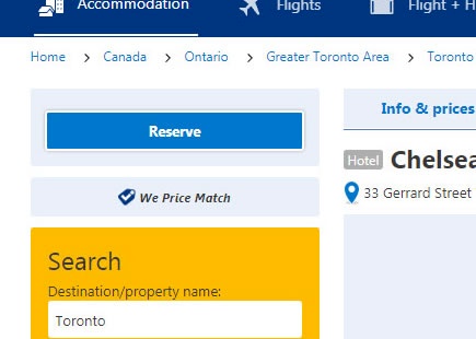
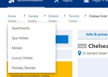
Booking Sticks To A Traditional Breadcrumb After Rejecting A Multi-Dimensional One
Booking ran a sitewide experiment where they tested two types of breadcrumb navigation. The contending variation showed a breadcrumb with two dimensions: displaying the geographical hierarchy of how deep someone is within the site (as expected), and also displaying a menu (on-click) with a secondary dimension of stay types for each level. It might have seemed like a nice idea but it didn't cut it. As the a/b test completed, the idea was rejected in favor of the old-school breadcrumb approach. Nice try booking. :) View Leak
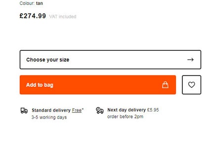
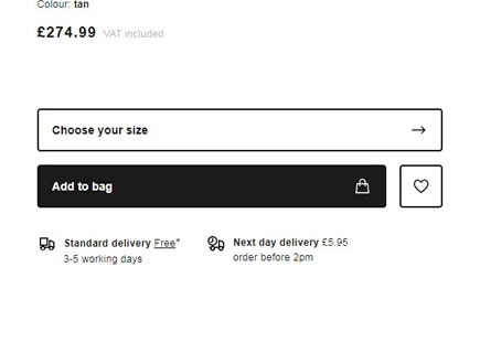
Zalando Tests Black Add-To-Cart Buttons
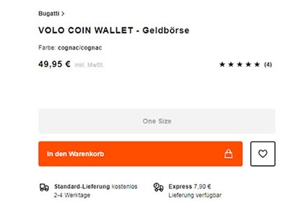
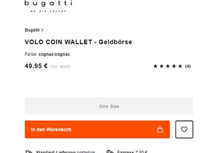
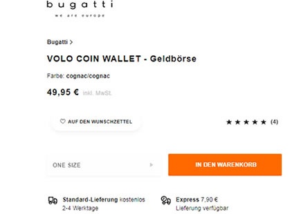
Zalando ran a simple experiment on their product page where they challenged their existing orange add-to-cart button against a black one. One month later, the black button was rejected even though the black one had a higher contrast ratio. [UPDATE: the outcome of the experiment was flipped with black being the eventual implementation] View Leak
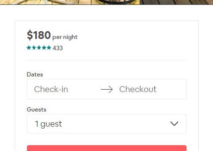
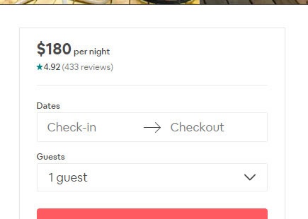
Airbnb Discovers A Better Way To Display Customer Ratings In This A/B Test
In this tiny and well isolated experiment, Airbnb tried a slightly different approach to displaying customer ratings on their property (product) pages. From the observed implementation decision one month later, we learned that using decimal places for customer rating averages seems to be the better approach. :) View Leak
Amazon's Beautifully Designed And Failed Three vs. Two Column Layout Experiment
Amazon found the courage to run a beautiful a/b test where they put their old three column product page layout against a new two column one. Although the two column layout was arguably more beautiful with the addition of white space, margins and shadows, it was nevertheless rejected. Before it was removed we decided to leak it here to ensure its beautiful failure continues to teach us well into the future. View Leak
Airbnb A/B Tests And Rejects Full Height Photos On Their Landing Page
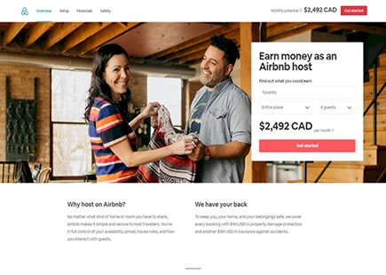
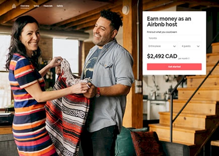
Airbnb ran an experiment where they increased the size of the header photo on their Host signup landing page. And interestingly it was rejected a month later. View Leak
Zalando Rejects A/B Tested Company Logos And A Smaller Add-To-Cart Button
Zalando (Germany) has been experimenting with at least two interesting cascade variations on their product page. Both of these variations seem to have been rejected which is consistent with other evidence in favor of larger buttons. View Leak
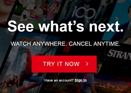
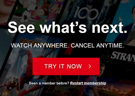
Netflix A/B Tests And Rejects Secondary Sign-in And Sign-up Calls To Action
Netflix ran an experiment with two variations of appended secondary links underneath the main "Try It Now" button. One variation had a link urging users to sign-in, while another urged to resume signing-up. Both ideas didn't make it and have been rejected. Here are my thoughts and comparisons on this ... View Leak
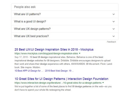
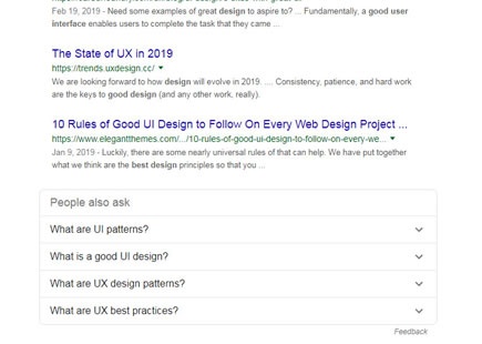
Google's Recommended Questions Are Better Off Below Search Results
What's more important first - search results or recommended alternative questions based on what other users ask? It's now clear that Google ran such an experiment on their search results with a clear decision in favor of the former (showing real search results first). View Leak
Netflix Finally Succeeds With These 3 Tested Home Page Patterns
If you might recall, some of the recent Netflix homepage experiments weren't so positive as seen here and here. Today however we finally detected what might be considered a successful roll out decision of one variation tested over a month ago. Gladly Netflix doesn't give up. Here are the 3 core changes which we think might have influenced a positive outcome. View Leak
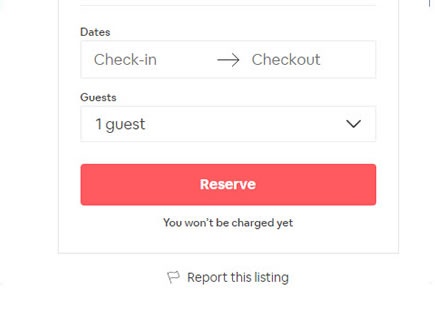
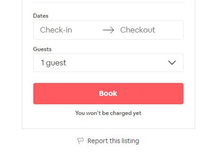
Airbnb A/B Tested These 3 Button Labels And They All Failed
Button label tests are easy to setup, including this one that Airbnb ran on their property listing pages. In total we detected that they a/b tested 3 variations against the original control. One month later, all treatment variations were rejected suggesting that the "Reserve" button defended its superior performance. View Leak
Netflix A/B Tests And Rejects Free Trials
Netflix has been offering a 30 day free trial for Canadians. Sometime in May however we spotted something way more interesting - they began a/b testing different trial durations (30, 14 and 7 days), as well as an immediate payment-first approach (without a trial). View Leak
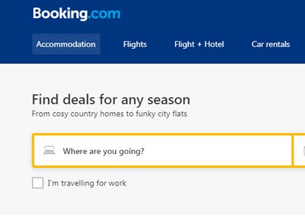
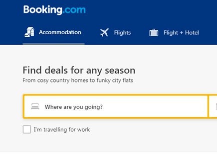
Booking Also A/B Tests Icon Labels Replicating Google's Recent Experiment
It seems like Booking just completed running an experiment that is very similar to a recent one from Google. The experiment evaluated icons with labels in the top navigation against a control version with labels only. View Leak
Google Has Been A/B Testing Link Colors (Again) And This Light Blue Didn't Pass
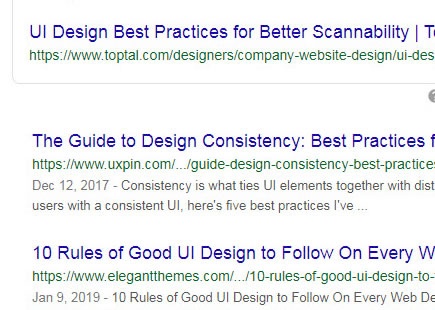
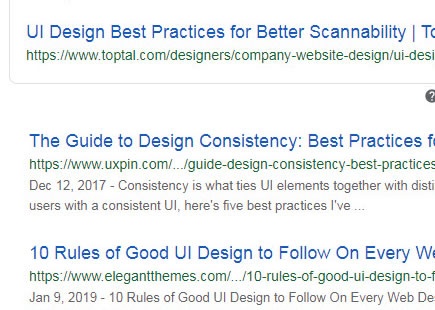
It's been a decade since it was first discovered that Google has famously tested those 41 shades of blue. Last month I discovered that they began experimenting with link colors on their search results screen - once again. This time Google tested a lighter blue with a lower contrast which turned out that they rejected (most likely due to a negative experiment result). View Leak
Booking's A/B Test Reveals More Impactful Search Criteria - Higher Location Tiles
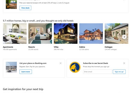
Perhaps it's no surprise that when people wish to book a getaway, expressing a location is of higher importance than anything else. Interestingly, this has been confirmed in a recent Booking experiment which tested the position of various elements on their homepage. The A/B test, along with its implementation decision, revealed that shifting the location tiles higher up seems to have performed better. View Leak
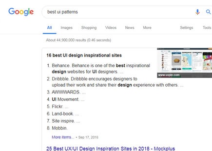
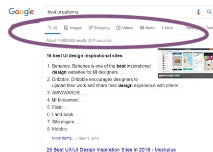
Google's A/B Test Is Hinting That Labels With Icons Are Better Than Labels Alone
Take a look at these two screenshots, both taken on May 15, 2019. With some cookie clearing magic in between it's pretty clear that Google ran an icon experiment on their search results page. The control version had labels only in the top nav, whereas the variant contained icons in addition to the labels. The variation was implemented a month later in June. View Leak
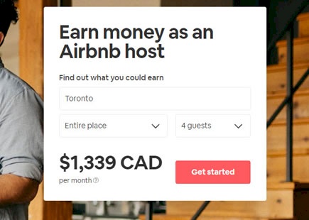
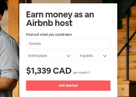
Airbnb Switched To A Bigger Button After Running This Design Experiment
Here is a perfectly simple optimization of a "Get started" button on Airbnb's host signup landing page. Airbnb ran an experiment of a smaller vs larger button size. I know because I managed to capture two diverse screenshots with the same date stamp. :) More so, a few months later Airbnb rolled out the later button to 100% of their traffic - hinting at a successful experiment outcome. View Leak
