Why Did Our Best Variation Fail?
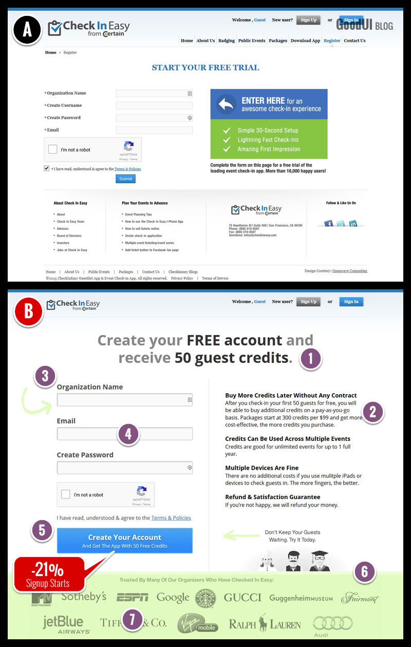
We just completed a three test project for www.checkineasy.com - an event planning & management platform. The tool allows event greeters to check in their guests very quickly using one or more mobile devices. The platform requires a free application download, a free account, and guest credits which can be purchased later. When we set out to optimize the existing signup screen for more signups (of course), our initial reaction was that stylistically it was quite busy. We started asking ourselves if by simplifying the user interface, and applying a handful of best practices, higher signup rates could be reached. It wasn’t long before our first variation launched and flopped. Here is what we've done in variation B:
The Two Signup Pages That We Tested In Test 1 Of 3

1. Giving A Gift
The 50 Guest Credits were emphasized as something users would receive. (GoodUI #2).
2. Explaining
The pricing and credit structure was explained in depth (replacing 3 existing benefits). (GoodUI #68).
3. Top Aligned Labels
Form labels were placed above the form fields.
4. Fewer Form Fields
The username field was removed (with the email address being passed on instead). (GoodUI #13).
5. Bigger Click Areas
The size of all buttons and form elements was increased. (GoodUI #38).
6. Keeping Focus
The standard footer with additional links was removed. (GoodUI #16).
7. Social Proof
Logos of existing customers have been shown in the footer. (GoodUI #4).
So Why Did All Of These Great Ideas Fail? You Tell Us First!
Yes, variation B which contained a number of our supposedly “best practices” resulted in a -21% drop to signups. It is not uncommon for what we think will perform well, to have an opposite effect - that’s why we tested it. The key take away of course is that it’s important not to give up on the first try. That's exactly what we did with the project as we designed two more tests to answer this question. But before we share them with you, we'd love to hear what you think as to what the cause might have been. Please share in the comments section.
Update [Nov 5]: One More Variation To Provide Additional Clues
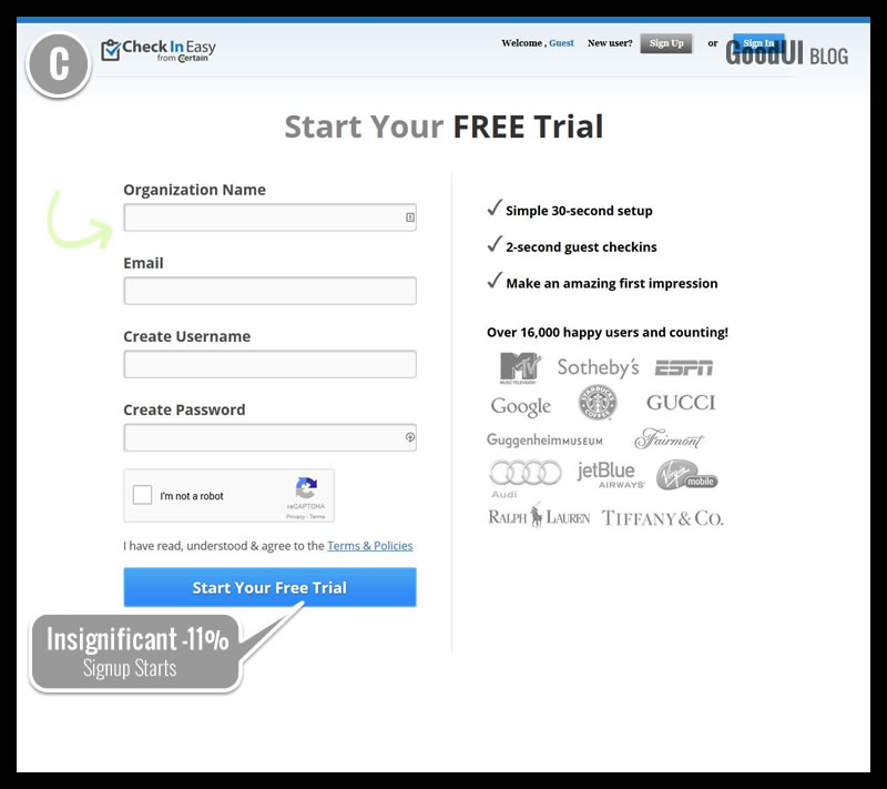
Like many of the reader comments have already pointed out, we also started speculating that the control's headline might have been more effective for various reasons. The 50 guest credit gift might have been irrelevant or even causing anxiety. More so the control's reference to "trial" instead of "account", might have carried more value. Finally, variation B also might have been showing a conflicting message between receiving a "FREE Account" and then showing overwhelming amount of pricing related messaging. Reverting variation C slightly back to the control, we then turned it into a test. As the data started coming in (and we were acting on thin data in the interest of time), the new variation C started performing better at an insignificant -11% (ranging widely between -32% to 11% with a p-value of 0.43). This was good news as the needle started shifting closer towards the control. It began confirming that some of the changes in variation B were in fact hurting and we were beginning to identify why. We did not stop here. We ran two more variations, one of which finally generated a significant win.

Read The Complete Story In Issue #19 + With 2 More Variations
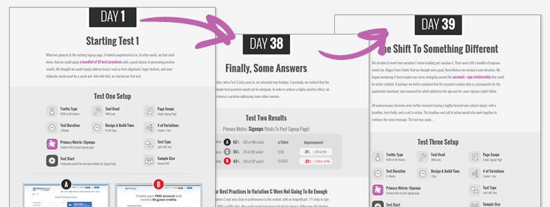
Be sure to grab the full story where we show in detail how we managed to score a +15% signup rate with two more follow up tests. The issue also includes: additional screens that were tested, the testing strategy used (Making Big Leaps), our reflections on the process, transparent data, and a blueprint template. Issue #19 now also comes with day snapshots which show exactly what we did from one day to another:

 Jakub Linowski on Nov 03, 2015
Comments
Jason 9 years ago ↑0↓0
Interesting post and seems like good information on best practices. I just wish that you would use them on your own site!
The bottom of the article has a call to action - literally a big red link - that says "Read The Complete Story In Issue #19". However, when I follow that link I don't get to read the complete story in issue 19. I don't even get to issue 19. Instead I go to a page that seems entirely unrelated promoting something called "DataStories" that I've never heard of before. Its only after scrolling 2 page lengths and sorting out major confusion that I realize what's going on. DataStories is the name of a publication and issue 19 is one instance of that that publication. And oh yea, I have to pay $239 to actually see the issues - or is it $39? And what does it mean to "subscribe" to one issue?
I was very interested in the case study. However, your own site was so confusing that I just lost all faith. I no longer trust your expertise or believe in your ability to demonstrate best practices to me. Thanks anyway.
Reply
Jakub Linowski 9 years ago ↑0↓0
Hi Jason. Thanks for the comment. Agreed, that it could have been way clearer. I now adjusted the link to point to https://www.goodui.org/datastories/all/#19 for a bit more clarity. Cheers.
Reply
Mia 9 years ago ↑0↓0
Perhaps if the CTA button were more button-y and less advertising banner-y it would tweak the results...?
Reply
Alex 9 years ago ↑0↓0
I wonder if it has something to do with the page being split into 2 columns. Perhaps that's one too many!
Reply
Jakub Linowski 9 years ago ↑0↓0
Now that's one of the changes in variation E (covered in the full Datastory Issue). :)
Reply
Peter 9 years ago ↑0↓0
Visually the form too big. Hard to take it In all at once. Looks like a screaming used car-dealer ad.
While button was bigger, it was too wide and didn't look like a button but yet another ad.
Reply
Andy 9 years ago ↑1↓0
To me, the first one is a hands down winner, even if it was "busy". Even with all of the business, it was very clear to
1.Start your free trial
2. Enter here following the left pointing arrow to the form.
The second variation was a page of sameness with nothing standing out giving me direction. There was no apparent flow. I did not even read it. Repeat, I did not even read it.
Now with both, I am not sure what you are offering, but I probably would have known if I was directed via a good ad, search or sale funnel.
Reply
Andy 9 years ago ↑0↓0
Now that I am thinking about it instead of giving you a knee jerk reaction, I need to add, it just might be the headline. It confused me totally, and when I looked at the rest of the page, all of the things that I stated above became true.
Reply
Vahur Metsala 9 years ago ↑0↓0
I'd go with everyone suggesting the #1 and #2 failure. This is a very personal and subjective opinion, but "credits" in general seem a complicated thing. It's like an online game or gambling thing and I wouldn't want to deal with credits VS a simple monthly plan...
Seems like one of those instances where the company jargon and user benefits have been confused.. i.e. 50 credits is a lot from the company's perspective but what does that mean to a user? 50 free check-in's? 100 free guests? As a user, I would want to know the benefit in my terminology... I can't even begin to tell you how often this happens in a larger telco company setting :D
Reply
Jakub Linowski 9 years ago ↑0↓0
By the way ... a huge thanks so far for sharing all these amazing reasons why it flopped. Update still coming in a few days.
Reply
Victor Bejar 9 years ago ↑0↓0
Definitely there is more cognitive load for the user. "Free account, with 50 GUEST credits" is hard to understand. "Free Trial" is easy to understand. I would have to read the description to really understand how things work. Option A benefits are clear and easy to ready. Option A form is more conventional (username, password, email).
Reply
Dave Mulder 9 years ago ↑0↓0
I agree with the comments about the account vs free trial language, as well as the surprising introduction of "guest credits". It's a gift, but it's like trying to incentivize someone with a mystery box.
I think there's also something to the checkmark bullets in the original version. "30-second signup", "lightning fast check-ins", and "amazing first impression". They reinforce the idea that there's something remarkable worth signing up for.
Reply
John Henry Müller 9 years ago ↑0↓0
As a new user, I don't have context to what "guest credit" means. So a gift of 50 doesn't seem like a gift at all. If fact, this new currency promotes an unknown and causes anxiety.
I know what "Start your free trial" means. Try it, then like it or leave it. No risk.
Reply
Richard Vaughan 9 years ago ↑0↓0
I think the mention of buying credits and showing the pricing structure a on Var B was the thing that affected signups. It would be interesting to see what the upsell and/or churn was on the variations, it may in the long run not be a negative thing to deter those who are scared away from the prospect of spending money.
Reply
Delmania 9 years ago ↑0↓0
When I look at variation A I feel like I need to sign up. The big arrow pointing the sign-up form, the short lists of benefits almost compels me to register. Variation B just seems more passive to me.
Reply
Vlad Malik 9 years ago ↑0↓0
"Passive" is a neat qualifier for this variation. I do think it's more passive, because there is too much happening. It's a signup form trying to be a landing page. Sometimes that works though, because people really can land on a from directly, and some landing pages are just glorified forms ("Buy my book" etc). But I think it's best avoided. Forms are functional. We tried replacing this form with an inline form on the home page in one test. Jakub, did we write about that somewhere? Seems relevant.
Reply
Nenad S. 9 years ago ↑0↓0
Point 1 - Clients who need this software don't care about the money as much as reliability, so offering free credits makes them feel you're selling an app, not reliability. Plus, offering free stuff isn't in line with premium services and offers. If their clientele is of that type, that's an additional turn-off.
Point 2 - There's too much text, it takes away the focus from the form that needs filling; the users don't want to read at that point, but go through the process. A better solution would probably have been to provide plain links or snippets BELOW the form which address what users might have in concern at that time.
Point 7 - It's visually more distracting then just having the footer, and makes the page feel too full. This one I don't agree as well.
Let's see what you came up in the end!! :)
Reply
Sara 9 years ago ↑0↓0
1. Commitment: creating an account, even when it's free, is somehow more overwhelming than starting a free trial.
1.b 50 credits wiil be enough for me? What does 50 credits mean? What can I do with them? Stating a limited amount of credits brings more confusion than clarity. Sign up pages are for signing up, not for formulating new questions.
2. Too much info. People here want to be reassured. 3 bullets points that summarize what they found in the landing page/website should be enough.
3. Organization name: what if I don't want to involve my organization at this time? What will happen to this info and how will it be treated?
3b. This Alignment should make reading easy
4. I think this is great.
5. Cta is confusing. There are the questions about creating an account and getting 50 free credits and there is an additional question: what do I find after I click this?
Ps writing this on a iphone is very painful ;-)
Reply
Emils_W 9 years ago ↑0↓0
Probably it has something to do with ''free trial'' vs ''free account and 50 guest credits'', the core offer.
Maybe the users didn't find the gift (50 guest credit) valuable at all, just confusing.
But that's just a guess, I would do some user research and find is this out for sure.
Reply
Michael Sallander 9 years ago ↑0↓0
Like many others also pointed out on variation B #1 and #2 are likely hurting it. If you kept everything else about b the same but reverted the copy change from #1 and #2 back to the original, I think you would see better results.
Reply
David 9 years ago ↑0↓0
Signing up for a free trial gives the impression that you will get the full range of features available, but for a limited time. It allows users to experience & evaluate the full value of the service before committing any money to it.
In Test B, this changes completely. A free account is available, but the scope of whats possible with it are limited by credits. If I was contemplating signing up for this service, I'd like to see whats possible with 50 credits, what features are available, and how much they cost (and I'd want to know all of these up front). With a trial, I don't necessarily want to know all of this up front, as I know theres time to find this out later after I've used the trial account for the initial reason i.e. checking in.
Reply
Adam Szabo 9 years ago ↑0↓0
I personally like the changes made except number 2 (explaining).
Too much text might distract visitors from the main goal.
I think the four headlines would have been enough without the explaining text.
I would have also put the signup form in the center.
Reply
Bill 9 years ago ↑0↓0
Call to Action is 'Create an Account'. Who wants to do that? I'd rather have an awesome experience than another account.
Reply
Peter Murray 9 years ago ↑0↓0
I suspect the failure is due to users not understanding what they are signing up for. "Create your free account and receive 50 guest credits" for what?
The A version has the content "ENTER HERE for an awesome check-in experience" which tells the user why they are registering.
Reply
Matheus 9 years ago ↑0↓0
The B test looks awesome and I can only guess what could drop the signups.
The A test has an arrow in a blue area, very attractive by the way. That arrow draw attention to the form on the left side of the screen, making users signup.
On the other side, the B test has only the big blue button "Create Your Account" on the bottom side and a text area describing the benefits. Maybe people are reading the full text and giving up to complete the form.
This is only a guess.
Reply
Vlad Malik 9 years ago ↑0↓0
I always thought that blue arrow box looked like an ad. And the arrow inside is inverted on a dark background with a box boundary separating it from the form it's pointing to. I assumed people would ignore it. A few commenters liked the arrow... curious if it's post-hoc analysis on our part or if new visitors really did notice it.
Reply
vicente 9 years ago ↑0↓0
#1 is giving me a free trial [for a possibly fantastic check in app. Worth the try]
#2 is giving me a free account [for what? again?]
No short explanation of the service on #2 in my opinion. Seems like no one reads further than a bullet list on internet..
My 2 cents
Vicente Ocana
Reply
Andrius | Adguns 9 years ago ↑0↓0
Free credits ... Buy credits. Confuses. Let's try to remove the Buy thing or soften explanation about Credits.
And there is no explanation about the product, what is it, why to use it, not clear the product itself.
Reply
Michael Facchinello 9 years ago ↑0↓0
The content is not nearly as good in variation 2. If you were to test variation 2 with variation 1's copy (specifically UI 1 & 2 as labeled on variation 2), it would win.
Reply