Let's Test This: A Better Modal Popup - Oli Gardner's Maybe Later Pattern

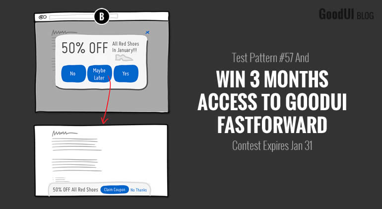
This week Oli Gardner from Unbounce.com came up with a really promising approach to modal popups - captured as Pattern #57: Maybe Later. Now I'd like to inspire more people to test this and see if it's actually any better than a traditional / annoying modal. Hence we're running a contest. If you a/b test this pattern on your site, and share your results with us to publish for everyone to see, I'll give you 3 months access to Fastforward - it's where we publish a/b tests to see which patterns have the highest impact & repeatability.
Do You Have What It Takes? Here Is What You Need To Qualify:
- Run An A/B Test On Your Own
You need to be able to conquer uncertainty and turn this pattern into an a/b test. That's the only way we can learn. Need an a/b testing tool? We like and recommend Visual Website Optimizer. - Minimum Monthly Conversions
You need to throw 1,000+ deep conversions (ex: signups or sales) per month at this experiment. I want these a/b tests to capture at least 500+ deep conversions per variant to have some reasonable statistical power. - Preregister & Start The Test Before Jan 31, 2018
You need to share the test link with me before we start. This way, if the test turns either south or north I will know. We want to publish any result (both negative or positive) to fight publication bias. - Open To Publishing On Fastforward
The test results will be published on GoodUI Fastforward right here under Pattern #57: Maybe Later (I will also enable public preview of all test data to anyone - as a bonus). It will be super fun to compare numerous results to see: how many go into the positive/negative, median effects, as well as try to understand and explain any drastic differences.
Ready? Here Is How You Should Setup The A/B Test:
- Testing Scope
You can run the test anywhere on your site with any segment (it needs 1000+ conversion per month). - Your Control Version
Let's make sure that we are comparing against an existing annoying entrance popup. If you don't have a standard (Yes/No) type of popup, then add it to your control or setup an A,B,C test (A=no popup, B=standard popup, C=Oli's-maybe-later-popup). - The Change
Take Pattern #57: Maybe Later and turn it into an a/b test. Please read all of the properties carefully. If you have questions, ask me. - Measure Goal 1: Shallow Metric - Instant Yes
As a shallow goal, please measure an instant "yes" reaction from the initial popup with any of the following: views of the offer, product page or signup page. - Measure Goal 2: Shallow Metric - Postponed Yes
As another shallow goal, please also measure the postponed "yes" reaction from the persistent footer with any of the following: views of the offer, product page or signup page. - Measure Goal 3: Shallow Metric - No's
Please also measure how many people press "No". - Measure Goal 4: Shallow Metric - Maybe's
Please also measure how many people press "Maybe". - Measure Goal 5: Deep Metric - Signups Or Sales
As a deep goal, most importantly, please also measure the completed signups or sales resulting (depending on your modal message / offer with visits to some final step). - Email Me Before You Hit Start
Before you start the test, please let me know (and share your A / B screenshots).
Ok, let's do this. You have until January 31. :)
 Jakub Linowski on Jan 19, 2018
Comments
Jakub Linowski 7 years ago ↑3↓0
People try stuff in the name of science. In the name of exploration. :)
Reply
Ivan Burmistrov 7 years ago ↑0↓0
What to explore in this case -- that people hate popups and sticky footers? This is already well-known... :-)
Reply